XR - Front Cover - Final Design
- Feb 22, 2020
- 1 min read
Updated: May 6, 2020
To Develop my book jacket design I improved and developed my previous designs shown in my last post. I chose to edit the placement of text and colours to decide which design looked best. One way to help me see what needed to be changed in my design was by printing the designs out on paper. Printing it out really helped me to notice stuff that I could not notice on computer such as alignment and text size.
Developments


I changed the colour of my original design to see what it would look like. I liked the colour of the rebel being a vibrant red because in my first design I made the red more transparent this made the red seem orange when printed which did not add to the rebelliousness of the design.

I made this design have a stronger red due to when it is printed the red looks orange. However due to the red being stronger it started to attack for attention with the title making it difficult to read. So I think I will not continue with this design as it is not as rebellious.

I changed the blurb of this design to make it easier to read. I like this design the most because it is seen as the most rebellious. To see if it will work for the final design I printed out this book jacket and made a mock up of what the book would look like.

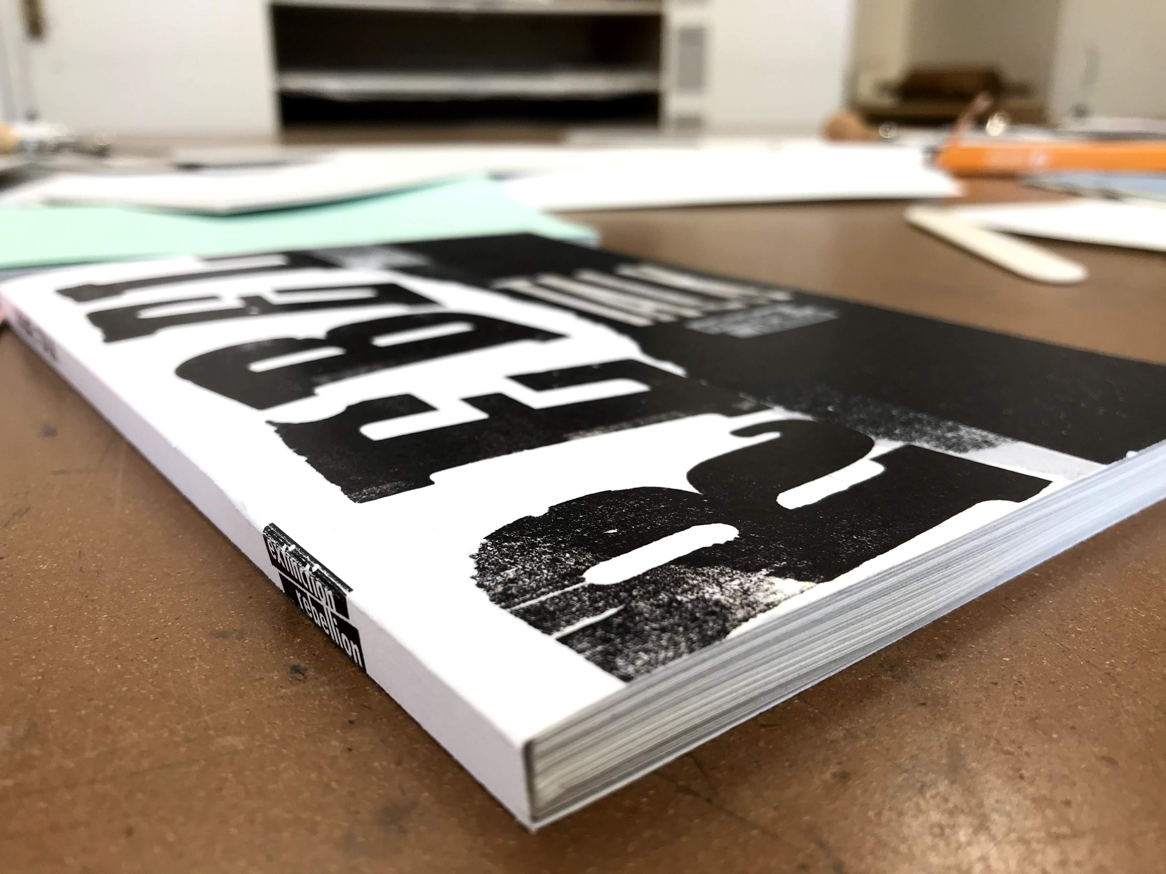
It works very well as a final printed design. The hierarchy on the cover is right there is a strong emphasis on 'rebel' due to its scale and the use of white space.


Comments