Dissenting - Poster
- Apr 30, 2020
- 3 min read
Updated: May 5, 2020
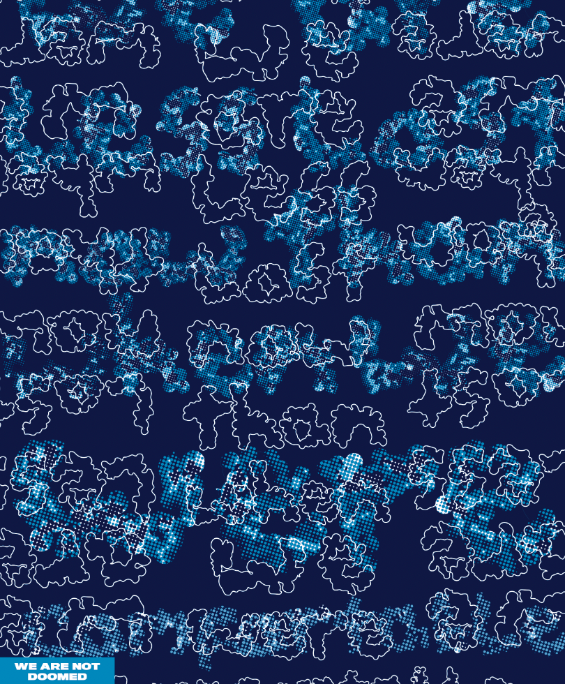
I started to develop my poster on from my previous one. I decided to add line to my poster to see if I could add another element to disguise the text. I decided to outline my font, because the shape in itself is an interesting image which I wanted to isolate and layer on top of my font in such a way to obscure what is underneath.
Method
To create my posters I decided to use Adobe Illustrator, it meant I could easily create line art whilst still be able to place my words into the file. To outline around my fonts I used the curvature tool (shift + ' ). I was able to click on points around the font to create the outline.
Posters

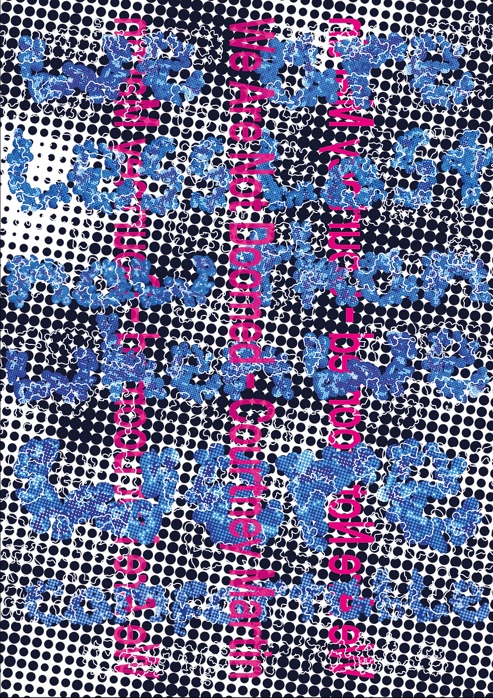
In these posters I have not prioritised what I want to be easy to read in this case the title and the author as the title will give a clue to the reader what might actually be said on a page. To move on I will get rid of the dotted background because it suddenly seems to make the page too busy as there is no whitespace so there is nowhere the eye can easily rest. Which is needed as the viewer does at some point need to read the quote.
Development
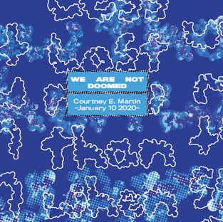
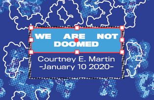
I decided to use a solid coloured box behind the author and title to separate from the background making it easy to read. I went through a few variations before I came to my final design.


Final Design
I decided to keep the title and author in the bottom right hand corner because it covers up the least amount of words in the poster. I then went in and sorted out the kerning for my font. I used TitlingGothicFB Normal font from the Adobe Fonts. I made the title 'Black' and the author/date 'regular' to create a hierarchy. Meaning the viewer will see the title (the most important thing) first and then the author/date.
Context
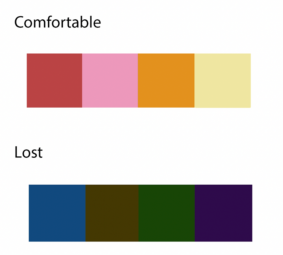
Context for this poster i.e. where it is situated, is even more important than the poster itself. In order for this poster to make any impact it must be shown in public spaces. To make impact I also decided it needed to be repeated because if it is put in place where most people are moving past such as the escalator in a tube station it would not necessarily would be taken if only viewed once. So I decided to use different bright colours to help vary the poster. To make sure the colours were still relevant to the quote I made a colour pallet of colour which convey comfort or loss the two main themes in the quote.
To change the colours of my poster without having to change every single element in my poster. I moved my poster from Illustrator to Photoshop and used the selective colour mixture tool to change the effects of my poster.


Here are some examples of where these posters could be placed:
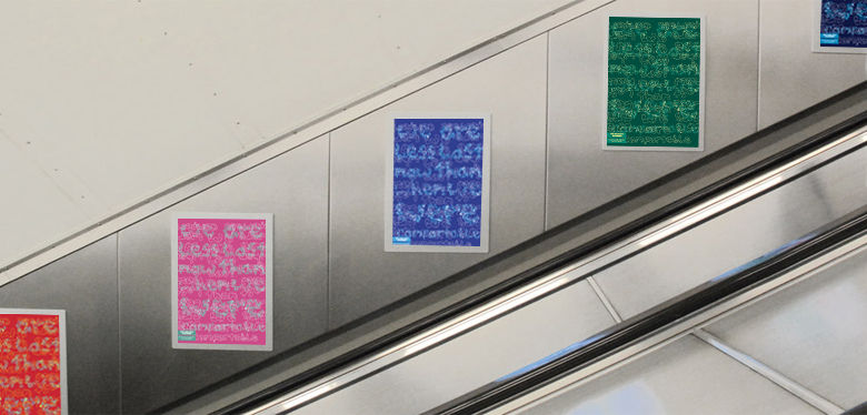
Escalator in the tube

Billboard in the tube
Printing
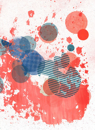
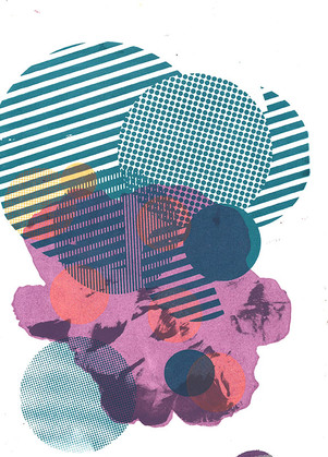
If the current circumstances (Covid 19 crisis) were different where I would be able to produce a proper print poster because I would be in the department with the necessary equipment. I would have tried to screen print my poster and used different inks and techniques such as foiling to create my poster (some previous examples of my work that I had created in the previous semester are below). The reason I would choose screen printing over any other form of print is because it would mean I could quickly experiment with different colours and do some of the experiments stated in Josef Albers Interaction Of Color. I know that the colours in my printed poster would come out different to my digital version.


Comments