XR - Development of Front cover
- Feb 12, 2020
- 3 min read
Updated: May 6, 2020
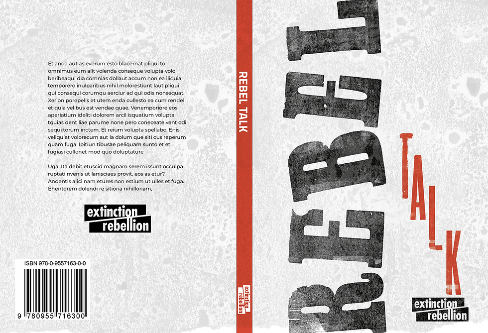
After having scanned my designs in (the ones I created on letter press) I went into photoshop to refine my designs. Due to the clients wanting the cover to mostly be black and white with little colour (red as an accent). I converted all my designs to Greyscale TIFFs. The reason I made the designs greyscale is because I had much better control on changing the tone of the image it is also makes the monochrome more saturated. I made my designs TIFFs because it does not compress the files (does not loose quality). It also means I can easily add the red accent colour to the image.

To change the tone of my image I used the levels control to change the tone of my image (seen above). I also was able to select and move the letters on my designs to make them work better together. On some I was able to replace a letter with a letter from another design if the later came out clearer.
The Designs
I created four designs on InDesign. Which I tried to create a different style on each.
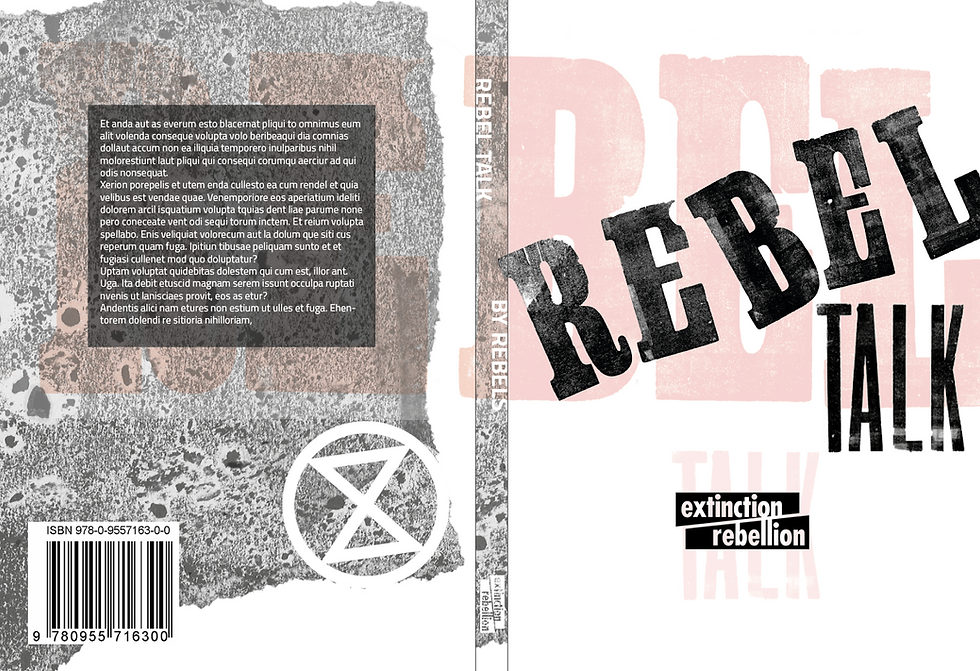
This design I tried to use Hierarchy to help the viewer easily navigate the design. I made the title the most saturated in colour to create dominance. I also put the 'Rebel' diagonally across the page to create contrast with every other element on the page helping to emphasise the idea that this book is about rebellion. I put a lighter red 'Rebel Talk' across the back and front to help link the front cover with back and also to add an accent colour and bring some texture and interest in the background. I used a bit a packaging to add a rough texture to give the idea that this book is not for the innocent or the faint hearted. To bring the blurb forward from the background I put a black transparent box behind it to try and emphasise the blurb.
I think is probably my weakest design because I have not made it 'rebellious' enough. I think because the red is very powerful making the 'talk' the first thing the reader sees which does not emphasise the 'rebellious' side.

I am also pleased with design, I like the layout of the 'Rebel Talk'. Making the 'R' really big emphasises how important the 'Rebel' is already getting a clear message across to the audience. I made the scrap packaging at the top red and more transparent so It is not fighting for dominance with the main title. I found when it was more saturated red or black it was difficult to find the title and the hierarchy was out of order. On the back cover I wrote 'Talk Rebel' so when the viewer goes to the back it will help push the idea that we need to rebel against the system to save our planet.

I inverted the 'Talk' on the black to help it stand out against it but also keep the texture. I do think the texture in the background maybe fighting for dominance in with the 'Rebel' just because the tone of black is the same and as the rebel. However, the 'Rebel' is still contrasting with the background bringing it forward.
Research
To get Inspiration I looked at the 50 books/50 covers competition this was a great website to get inspiration because it had all the best book designs from the last 9 years.

This book by The Original Champions of Design what inspires me is the bold use of a busy background and how if you look closer it describes the meaning of the book through white images. The whole thing is slightly difficult to understand showing how the idea of equality and where it lies is difficult to understand. This is shown through the placement of equal where the 'E' is positioned above the 'QUAL' contrasting with the word because the 'E' is not equal with the rest of the word.

By Anne Jordan and Mitch Goldstein This book used texture and monochromatic scheme to create and idea for the viewer when seeing the book. The author made the letters look like it was being wiped out i.e. uncovering the whats underneath. I was mainly inspired by this because they used the monochrome to describe racism i.e. black and white.


Comments