Dissenting Voices - Continued Research
- Apr 3, 2020
- 6 min read
Updated: May 6, 2020
To continue on from my initial research I decided to research more extensively the ways in which I could obscure my poster and how I could make my type into an image.
Josef Albers
A very well known German Artist who was famously known for his colour theory driven project 'Homage of squares' where he experiments with the interaction of colour.
Albers, J., 1963.Interaction Of Color. 4th ed. New Haven: Yale University Press, pp.88-89.

In this image above it shows the best example of colour interacting with each other. The two crosses in the middle of each square look like different colours it is only when you lead your eye down to the bottom and see the crosses are joined that you realise the colours in each cross are the same. This interaction is something I want to use in my design to help trick people's eyes when viewing my poster.
Hamm, J., 2004. JOSEF ALBERS’S MONUMENTAL HOMAGE TO THE SQUARE. Studies in Conservation, 49 (sup2), pp.179-184.
"In enlarging from one sketch to another, he finds that fixed relations of color and form alter with changes in size of the entire design." - Elaine de Kooning
"that each color is changed by a changed environment, you eventually find that you have learned about life as well as about color. " - Josef Albers
Holloway, J., Weil, J. and Albers, J., 1970. A Conversation with Josef Albers. Leonardo, 3(4), p.459.
"Look here: One finger and one finger are two fingers (both are my forefingers, in a vertical position). Now try to forget that we are dealing with fingers and concentrate on their width, which is about three-quarters of an inch. With this, you see an abstraction of the fingers. Now I place them closer together (parallel), at a distance of also three-quarters of an inch. And now - one finger and one finger present 3 equal distances - in short, 1 + 1 = 3 (and it is easy to continue 1 + 1 = 4, etc)"
- Josef Albers
Over printing
Through researching printing methods I came across over printing which could be an interesting way of how I could obscure my text. Over printing is simply what it says it is, there are layers upon layers of prints on one page.
Ambrose, G. and Harris, P., 2005. Image. Lausanne: AVA Publishing SA, pp.18-19.

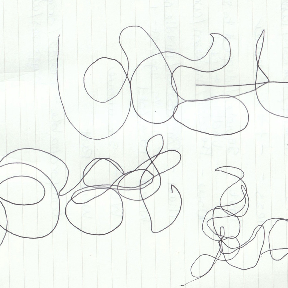
Once reading these articles I created my own samples through finding a sans serif font on Illustrator, type out my quote and manipulating the size, orientation and weight of it. Then I printed many different forms of the quote on top of each other. I found creating these samples made me realise this is an interesting way into creating type into an image.


The most successful sample in creating something that was difficult to see is the first one where I printed the same document 10mm smaller each time. I also think the second one was also successful in the way the quote is going in many different directions making it difficult to fix your eye on one point. However, I do still need to develop this Idea as the rest of the samples were very easy to see. What I will do next is establish a font(s) I would like to try and then continue with this technique because I think it could be quite interesting.
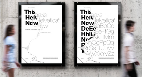
MuirMcNiel - 8000 Unique Covers for Eye 94 Magazine

I researched MuirMcNiel's work for the 94th issue of eye magazine where the design house used fonts from MuirMcNeil's TwoPoint and TwoPlus type collections. It uses overprinting to obscure the words even more. I like how the letters are following Josef Albers rule of 1+1=3, this something I will also incorporate in my design. The designer cleverly used whitespace and negative space to make the word even more confusing to the viewer.
"a file in which the letters of the word ‘eye’ are repeated in fixed increments and in three layers, each set in a different font of their TwoPoint or TwoPlus typefaces. These are shifted laterally in distances proportionate to the letter spacing."
This was stated in an Eye magazine article about the cover. It explains how the covers were created. I will use this method of repeating with layers and shifting the proportions to create a difficult-to-see design.
John Warwicker - Mmm... skyscraper, I love you

Created by John Warwicker a designer for Tomato. Used many different layers of type on top of each other to create a skyscraper effect skyline. It obvious he has made type into a an image using the shapes of the type to create a skyline.
Font
Early on I established I wanted my typeface to be modern as it is about an issue that is present and right now. I also wanted it to be Sans serif so it was reminiscent of the CND's posters explained in a previous post. So in order to choose a font which is modern and current I did some research into the popular typefaces of 2020. As found on Creative Boom.


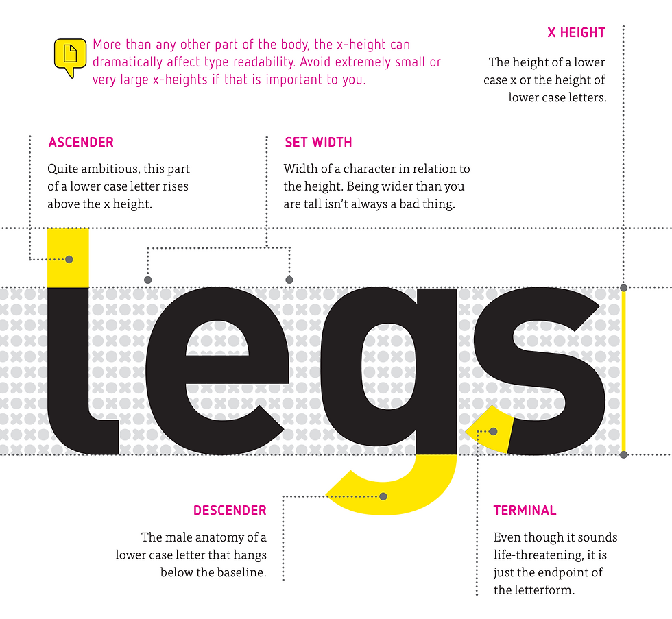
These are most of the examples that creative boom has shortlisted as some of the most popular fonts of the year. Now most of these are too expensive for me to use however I am trying to identify what are the main characteristics from all of these fonts so I can choose a font(s) that is relevant. The main similarities are that they are all geometric as each terminal has a straight corner and every ascender and descender has the width.
To understand the differences of all these type I had to learn the anatomy of type. I used a useful document from the font shop showing tips on how to find the best font.

I am going to find my font on the Adobe Fonts where most fonts are free to download. I am going to try and find a font which helps back up the message in my quote with strength, making the viewer believe in the quote they are seeing. The combination of the font, colours and placement will hopefully leave a lasting impression on the viewer.
With a further review on my work I decided that I also need to experiment more with making the type face uncomfortable to read and one way to do that is to change the type of font as well. So I will use the modern sans serif font however for some of the words I do not think the sans serif could work. I may mix with serif/script font as well.
Everyday items fonts
To make the type harder to view I may also create my own type of everyday objects (giving the idea the answer is right in front of you). I researched two people with this idea in mind one was SPIN and the other was Paul Elliman.
Spin - Computer Arts Magazine

This font is created from an item (bubbles) you would not think could be a font making ti at first difficult to realise it is a letter. This delay in having to process that it is actually a letter is something I want to have my own design.
Paul Elliman - Found Font

Paul Eliman a British designer he has created his collection 'Found' Font for the past thirty years. He creates this font with the bits and bobs he finds in everyday life. This is a way I would like to create a font through things found in everyday life.
Development
After researching these artists I went out to create my own 'found font' to start I brainstormed what each word meant in the quote and thought about how It could be shown through type.


I chose to create 'when' from some magazine spines. I chose magazines because they are record of the past and that they are comfortable to read, as there article are usually light, giving the connotations of 'when' through making the word link to the quote that in the past we were comfortable.

I chose to use a necklace chain for 'lost', because it is an item that can easily be lost. I made each letter not completely perfect as if it was slippery and could slip away and disappear.

I chose to use drawing pins for comfortable to make the type and word an oxymoron. As comfortable is the opposite to pins which can hurt. Helping to back up the message that our comfort in the past was more dangerous than good.
Development
To move forward in developing my found font I started to edit on Photoshop to try and make my words that I had created even more abstract, I used methods through the filter section in Photoshop, by creating words into colour half tones and crystals, to create different textures which may help to obscure the words.


Comments