Dissenting Voices - Placement
- Apr 28, 2020
- 4 min read
Updated: May 6, 2020
To move on from my found font I started to think about typographic placement and colour. I started off with trying to use my previous SPIN inspired words and adding colour to them.
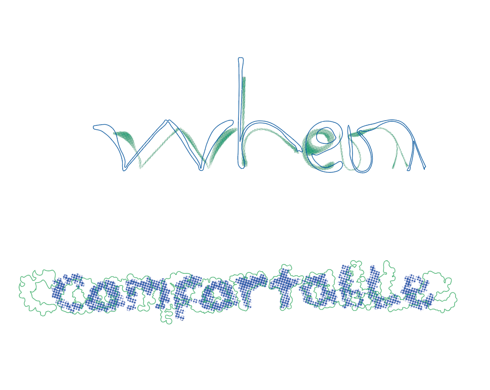
I like the use of line and circles, these two shapes create contrast. I will definitely use the line in my poster to confuse the viewer a bit more. As for the colour scheme I chose the dark green and blue to give the idea of murkiness that this quite is hard to see even though it is right in front of the viewer.

To keep on moving on with a more pointillist style, I used the technique of creating a CMYK colour halftone on my imagery for 'comfortable' compared to the 'comfortable' above which is duotone colour halftone. Out of the two I prefer the duotone as I have more control over the choice of my colours. I do think the pin background is successful in obscuring the word due to being dominant in the hierarchy of the image.
Placement
Initial Designs


I have decided to use the pin type font in my poster due to it being the thickest font meaning I have more surface area to manipulate on. I prefer the design with out the sans serif over the top I think the pin font works just as well alone as it is a type which is unknown to people so viewers will have to take time in being able to read the font. I think I will have to develop and think more about the colours because at the moment they do not work in add anything to the quote.
Development
To move on from my previous designs I thought more about the colour pallet of my design and how I could use the principles Josef Albers has talked about and put it into my own design.

To create this poster I changed the text to have different coloured dots to try and make it more difficult to see I like this effect of the lettering being different colours. The colour on the poster does seem more relevant to my quote and the dark blue convey the uncertainness of our times and the green and white glimpsing through gives the idea of hope coming through.

To move on and develop my design further I am going to experiment more with my placement of type and vary my colour scheme to find the best result.
Research
Type Tribute - LP and Casette Packaging
I looked at inspiration of what other people have done to obscure people perceptions I found this interesting example on Behance. In the way the letter were still fairly obvious but due to the substrate that is use it is difficult to see from afar.

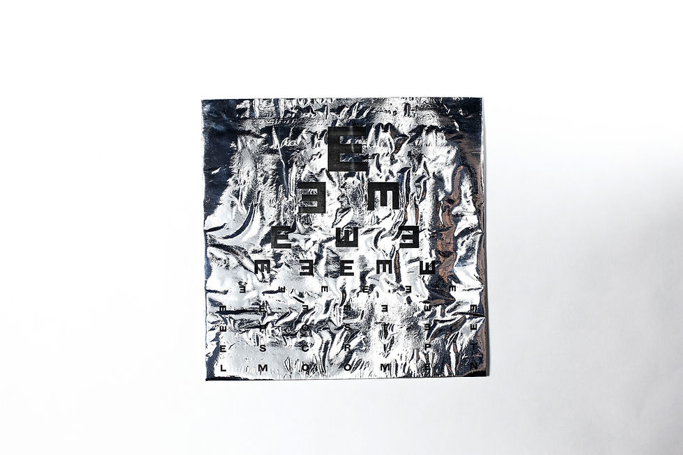
In their design they used the similar design for an eye test chart almost testing the viewer to see every single letter. The eye test chart is a design I may try and incorporate into my own design.
Gastrotypographical Assemblage

I researched The Gastrotypographical - assemblage. Created by Lou Dorfsman the art director of CBS network. This another example of interesting placement and due to the amount of different type it is much more difficult to view. This format is something I will experiment with, using a grid to create a misleading poster.
Pointillism
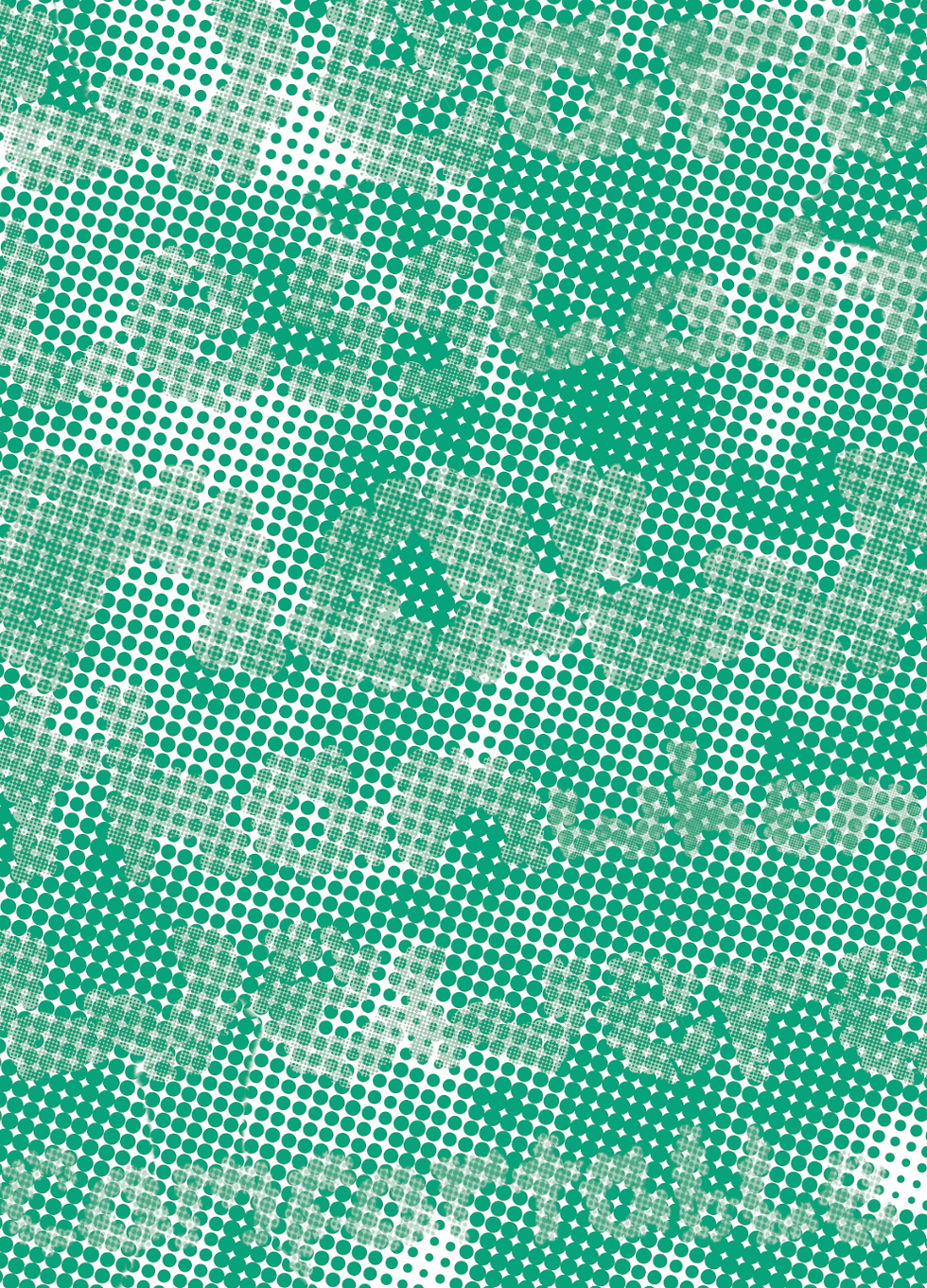
Pointillism is a Neo-Impressionist movement which centralises on using dots to create planes of colour. This movement is something I have been inspired through making my own designs using the colour halftone tool on photoshop. I decided to use this technique because it is an interesting way to confuse the eye and obscure my writing in the poster.
Regionale Bulgaria / Book Concept & Design

I found this inspiration on Behance it is an illustration from a book that details the different events that are going on in Bulgaria. This illustration inspired me to use halftone to create my poster as it was interesting way to obscure my own design and make it more difficult for the viewer to make out.
Bezold effect

Through reading Josef Alber's Interaction of Colour (p.33), I found out about the Bezold effect where Wilhelm von Bezold discovered that he could change the whole look of his carpet by changing or adding only one colour. The effect was in my mind when I was choosing possible colour pallets for my poster.
Marian Bantjes

Marian Bantjes has created a similar effect with her poster design that I am looking for where she has used colour to make the word sustainability appear from a pattern. This is similar to what I would like to do however I would like colour to be used to obscure the message and make it hard to find.
Stefan Saigmeister - Happy Film

I looked at the typography used in Stefan Saigmeister's Happy Film. There was many typography in the film however this typography (seen above) I find the most interesting as Saigmeister has used line to create and distort text so it is much more difficult to see. I definitely want to experiment with line make the text even more difficult to see.


Comments