Data Visualisation - update
- Nov 29, 2019
- 2 min read
Updated: Dec 9, 2019
My original plan to laser cut the lines of where I walk is not going to work because the laser cutter in the department is broken. Further more, I have realised the few mock ups I did were to complicated they did not show the data clearly enough. So I am going to reverse my thinking and try go along the 'less is more' approach.


So I have had to chop my data down I am just focusing on the line of my walk, my speed (through a heat graph), the duration and the amount of people I have overtaken. I have decided the duration will be numerical and I will experiment to see whether I want my overtake to be numerical or visual.

My plan to make it more visually interesting is to really experiment with paper stock and book binding. So to help continue my process I went back to the drawing board and researched examples of use of different colours and paper cutting.
Research
GF Smith
I researched the paper smiths ‘GF Smith’ because I was interested in using coloured paper now my data, is very simple I want to use colour to make my design more interesting. I found that they created books promoting there ‘Colorplan’ series using cutouts and different colours to make interesting the visuals. This is something I definitely want to explore and see how I can make this technique represent my data.

This image is GF Smith’s Color Plan ‘Play’ Book. Their aim is to make their books educational as well as interesting so using their different paper to create contrast through cut out was how they created it. I like the idea of the circles because I know in the department there are working tools for creating holes. I will definitely experiment with this to create contrast and interest in my design.
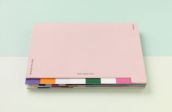
They also created a 200 page notebook with different coloured tabs. The tab idea is interesting it could be a easy and simple way to leaf through my data book.
Megastructure Schipol by Lust

I researched more into Lust's work as I had previously looked at them in my initial research. This info graphic the created was to show the data collated by the big airport in the Netherlands, Schipol, they once again used line to represent data and this something I definitely want to use in my own designs now I have simplified my data I want my line to be important.


Comments