My week in Data - Initial Research
- Nov 17, 2019
- 3 min read
Updated: Dec 9, 2019
Books
Knight, C and Glaser, J. (2009), Diagrams - Innovative Solutions for Graphic Designers, Hove: RotoVision SA
To start off my research I looked at books in the library that were to do with data research. This first book was interesting becuase it had many different case studies of data imagery.
NOORDZEE by Lust (P. 52)

This is an interesting visual representation of the cultural information that is happening in the North Sea. What I find interesting is they have collected data a similar to me (they have collected many variations of the same data) and collated them together making it an interesting design piece. They mainly used lines to show the different data that they have collected this is something I could definitely look at in my own design.
Hiscox LTD. Report and Accounts 2007 by Clair Warner and Ivor Williams (P.72)

This is a book stating the accounts of the firm Hiscox. The designers were told to make the report be "Told how it is" meaning the report is very simply and clear showing the facts. This is something I want to incorporate into my own design due to the fact I am making a book I would like to clearly represent the data so using the simple colour and type scheme could be something to consider.
Neopolis Master Plan by Stefan Boubil (P.114)

This is a brochure which turns into a poster. I am not interested in that fact, I am more interested in the fact that they used circles to represent the percentage of land used per development phase. This is something I could use to represent some of my data.
L'ELLIPSE by Adrienne Bornstien (P.188)

This is an article in a magazine representing the data of what would happen if an alien hen landed on the Earth. What I like about it is its simple representation of data and how formal it is for a surreal subject. This simplicity is something I would like to do in my own designs
Commentz, S. (2010) Data Flow 2, Berlin: Gestalten
Long Exposure Photographs of 80s era Arcade Games by Rosemarie Fiore (P.47)
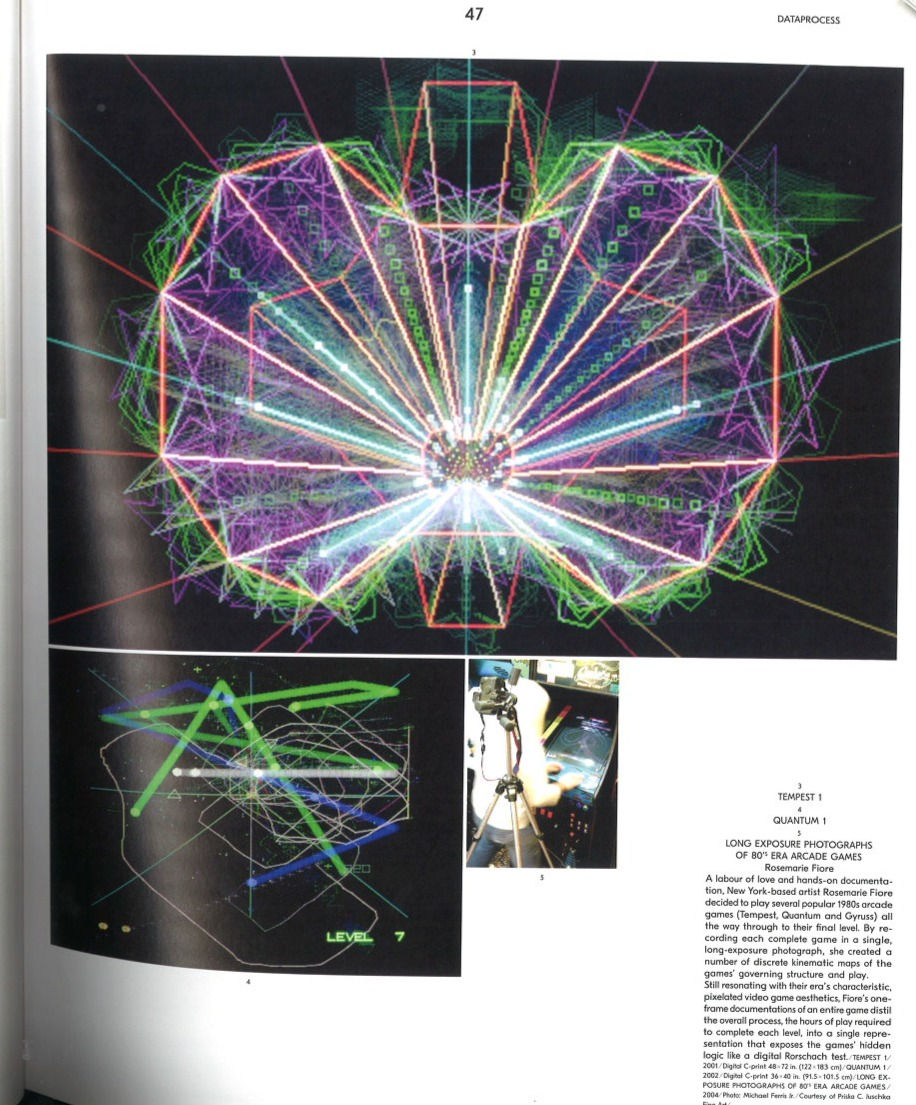
This work was interesting because through using a long exposure the camera was able to track the light paths and different width of line. This is something I would like to consider because some of my data incorporates line.
Extinct by Dongwoo Kim (P.106)
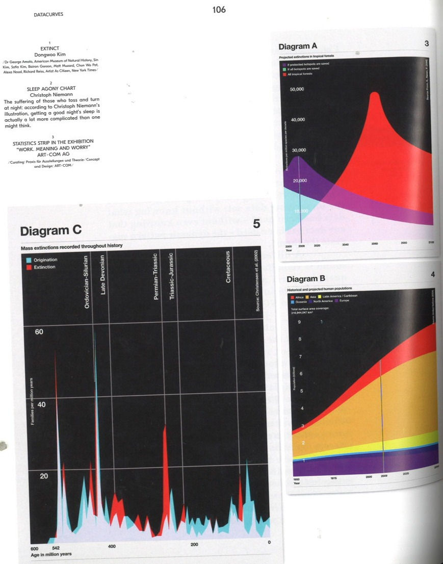
I like this graph and how it represent data. It is a simple flow chart but the simple use of colour to depict that different layers makes it very beautiful and simple to read. This could be something I could incorporate with my own raw data.
Where in the World City Maps Series by Mark Webber (P.200)
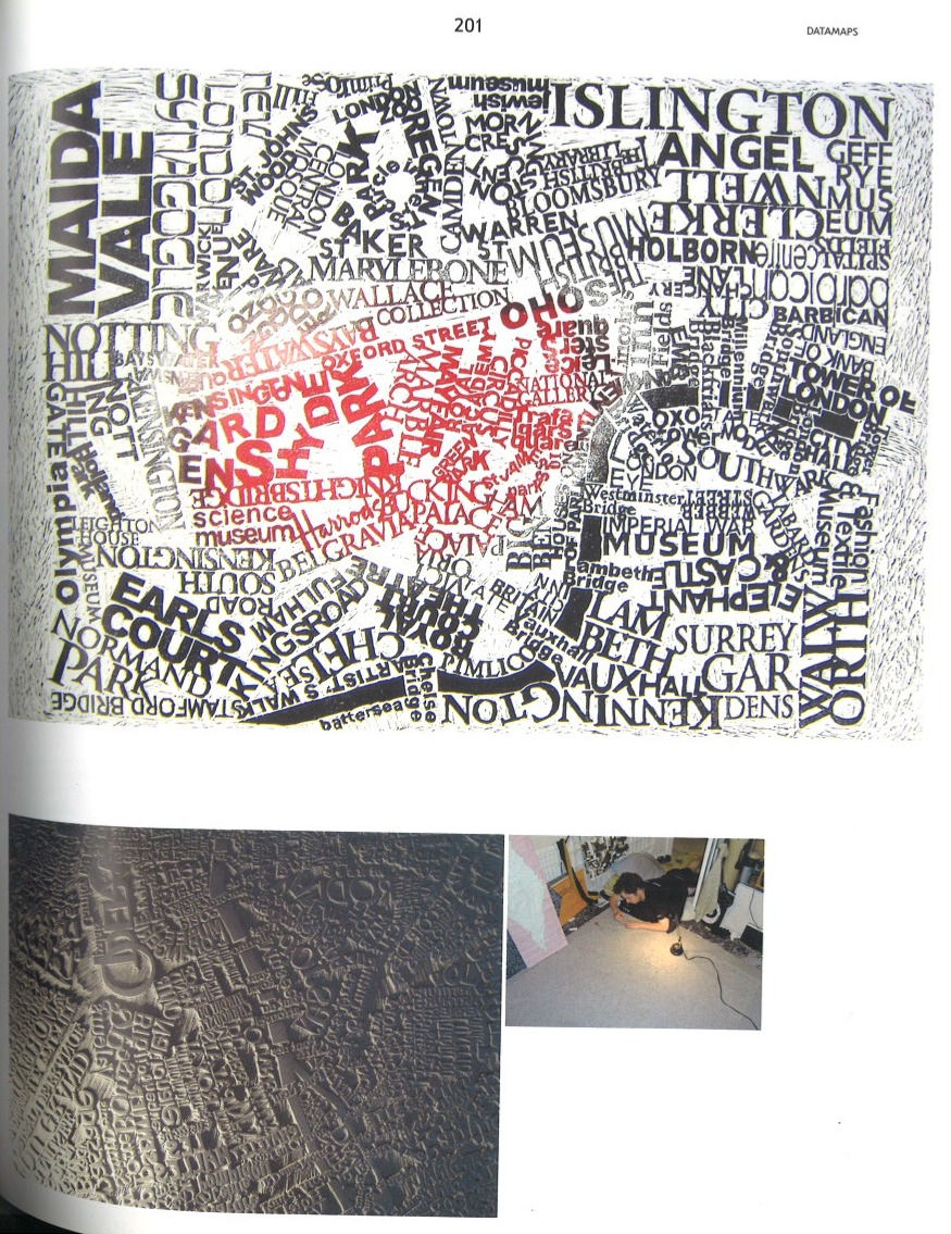
Through his use of lino cut printing technique Mark Webber made a map just out of words. This is interesting I mainly like it for its use of typography and how it clear but it also feels quite organic. Due to the fact that my data is where I walk outside. I want to allude to nature so making it more organic would be a way to do that. I think I will definitely experiment with letter press printing in this process.
Flocking Diplomats 4 by Catalogtree (P.224)

This is a poster representing photographs of when diplomats broke simple laws that everyone else has to abide to. What I like the most about this is the geometric jigsaw in the way the designer has placed this and with the simple text on top of each image to state which street the photograph was taken on. This is something I could use to represent all the images of the people I over took.
Online
Nicholas Weltyk

Nicholas Weltyk is an american graphic designer, the work I am most interested in his work of maps where using laser cutter he was able to create the contours of the map. This is something I definitely want to use in my own design each page has a line of where I walked that day.
Nike Run Data by Nicholas Felton

Nike tasked Nicholas Felton and his students at the Manhattan's school of visual arts to create a data visualisation of the routes 1000+ runners took for a month in New York. This is interesting to see another piece of design which is running alongside similar data to mine. I liked how they used heat graphs to show the most/least popular areas to run.


Comments