Final Book - My week in Data
- Dec 5, 2019
- 1 min read
Updated: Dec 9, 2019
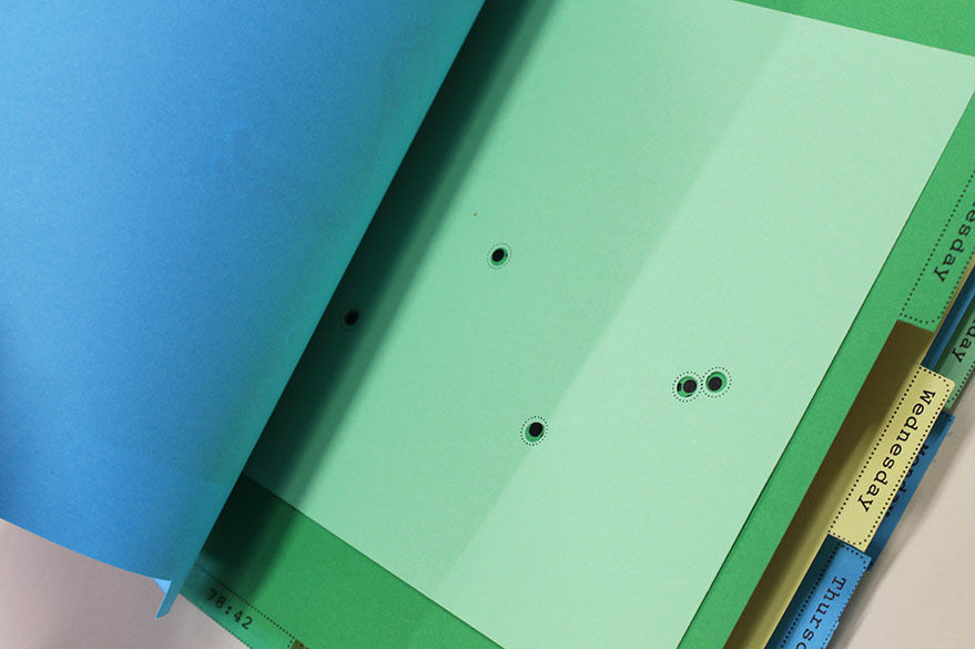
Overall I am happy with my final design of my data visualisation booklet. The colours work well together and the cutouts help to create contrast with the colours. The use of circles I like, it helps to represent the data I created.
If I were to do this again I would spend more time looking at the paper and colours. I would probably go to GF Smith and get samples of their Colorplan series so I could have more variation of colours and weight. I had limited variation of weight and colours in the department.
I would also want to record a more data (i.e. a month or a year worth of walking data) becuase I think the book being thicker would make it more intersting hold and flick through.


Comments