Colours - Data visualisation
- Dec 5, 2019
- 1 min read
Updated: Dec 9, 2019
When creating my data booklet I knew I wanted to add more interest to my book due to being inspired by GF Smith's Colorplan promotionals. I wanted colours which could contrast but also look pleasing to the eye. To avoid printing costs I got different coloured papers and just lined them up together to see which colours worked together and in what order.


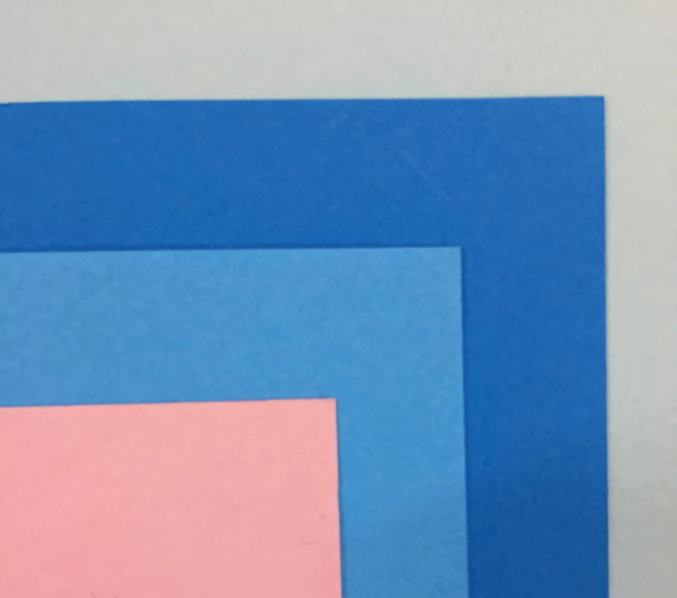

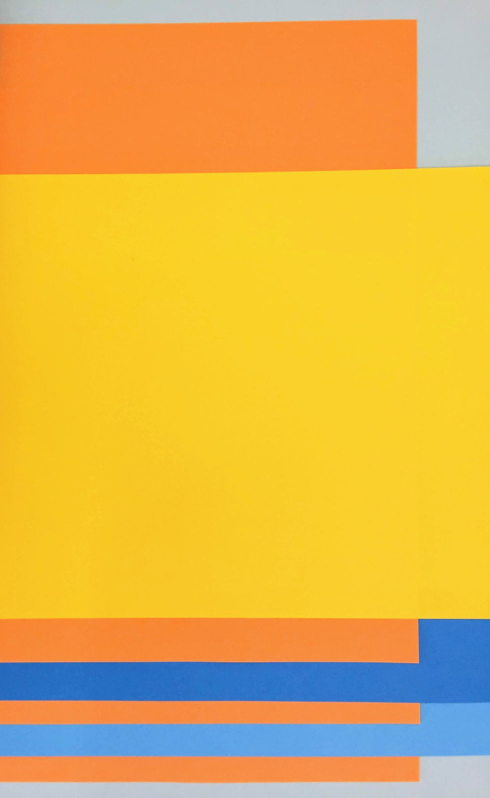

I experimented with many colours but ultimately I liked the last one because the colours all worked together well and created contrast. I know my book will be interesting to look at with that colour scheme. It is a simple colour scheme I did not want to go above five different colours because I knew it would overwhelm the eye. Combining all these papers together was a very useful technique and seeing what I wanted in colour.
I knew that all these papers would have to go through the laser printer so each piece of paper is 100 gsm meaning it has a quality feel but still easy to open and you are able to flick through the pages.


Comments