XR - Poems Format
- Feb 5, 2020
- 3 min read
Updated: May 6, 2020
This Lecture I focused on creating a good layout for the poems which will be the content inside the books. XR had given us a few restraints we had to work by:
All text should be 100% black Sanserif, 8.5pt/13pt. The overall style is ‘sentence case’ throughout (sentence case is when you capitalise the first letter of the first word in a sentence, including names) and including Poem titles, except of course for lower case poems, which have lower case titles if there is one. The only caps in the latter are for “I”, acronyms, and proper names.
Poem titles, they are not keen on the idea of pulling the titles off poems and setting them centred in black /colour. This turns them into external labels instead of integral overtures. Some poems have no titles and should be positioned at the same start as other poems. Sub-titles, several poems have subtitles, these should be type-set in italics and perhaps a smaller fontsize (8pt).
Development
To start I went to Adobe fonts (which all the fonts are free if you have a Creative Cloud subscription) I chose the fonts Monserrat, Cairo and Raleway. All Sans Serif as per the brief.

I then experimented with different point size, weight and justification to decide the best format.

This was my first idea it was quite simple all were justified left, 8.5pt and in Monseratt, The title was medium weight, poem regular, name bold italic and the place was semi bold italic. I think I put too much emphasis on the name and the place, it leads the eye right to the end before it has even read the poem which would create a weird rhythm on the page.

In this one I put emphasis on the poem instead of the persons name and place, meaning the rhythm was better. However, I made the title medium italic but through reading the brief, it states they do not want the title to be separated from the poem, meaning the italic separated the title and the poem too much.

Here I experimented with the justification but once again I separated the title too much. The weight was all regular and I decided I preferred a different weight to separate the poem with the credits.

In this one I changed the font from Monseratt to Cairo. All the weight's were the same however I justified the poem to the right and the author name/ place to the left this I found was good way to separate the two whilst still creating a nice rhythm for the eye. I decided I preferred the Cairo font to Monseratt because It looks more contemporary due to the similarity to the font Futura. I made the Leading 13pt for the poem and 8.5pt for title to help separate the two even more.

This was a further development of my design the weight of the poem was semi bold, justified right and the author name was regular justified left. I also experimented with my final font Raleway however, I decided I like Cairo the best due to its more condensed look which will link to the sans serif font on the front cover which is condensed.

This was my final design at the moment I think I may go back and adjust the leading. However, I am going to keep the font to Cairo and the Poem/title regular and the name/place light italic. I liked the right justification however I had to change it because some of the poems such as the poem on the left had certain formats which if I justified right would not work.
To develop this even more I printed it out on cheap paper to just see what the design would look like I realised that the placement on the double page spread would not work (not seen above). If you look back to two images above you can see that on the page the poems are not symmetrical I only realised after printing out so this showed me how valuable the printing process was.
Research
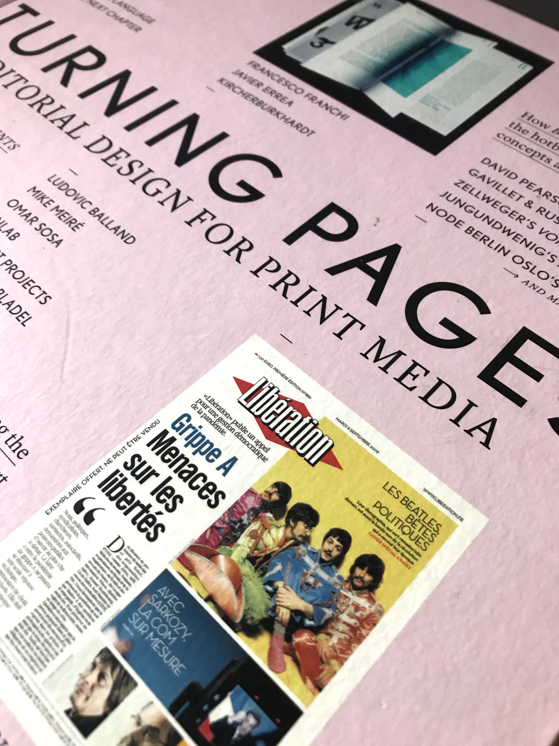
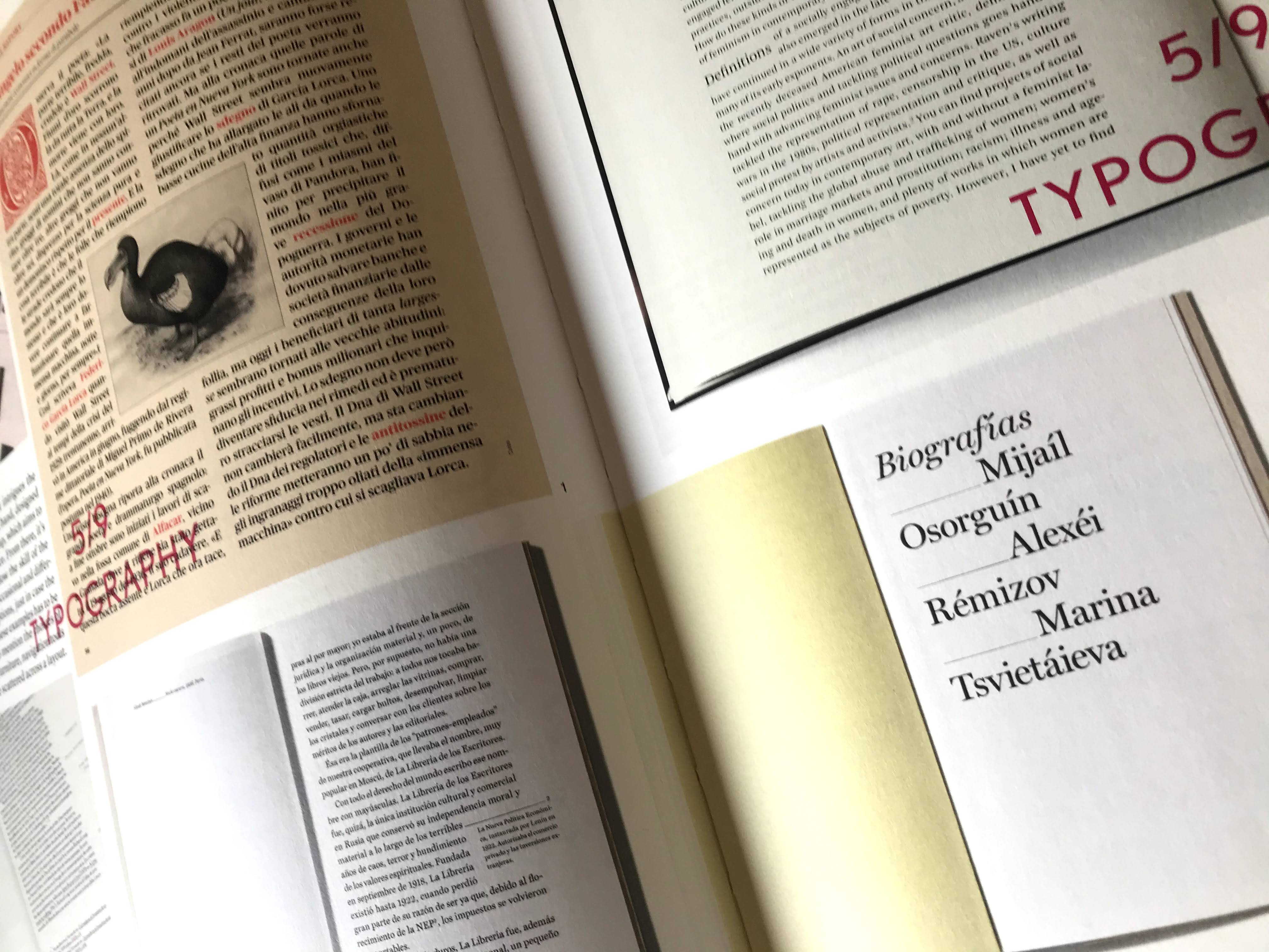
To help me with my design I read the book; Klanten, R. and Bolhöfer Kitty. (2011). Turning pages. Berlin: Gestalten, pp.50-51.
This gave me lots of inspiration on how to layout the page it also showed how to create a clear hierarchy on a page through just the use of type.


Comments