XR (Extinction Rebellion) - Day 1
- Feb 3, 2020
- 4 min read
Updated: May 6, 2020
The Brief
To produce a book jacket design and series of internal page spreads for the forthcoming poetry book, ‘Rebel Talks’ published by Extinction Rebellion, exploring the practice of layout (the effective placement of images and text) and the process of image making through digital and hand-made techniques.
Specifics
1 x book-jacket design – as per specifications on the template provided. 1 x dps (double-page spread) for the inside title page. 1 x dps for the contents page(s). 1 x dps for the section pages
A series of double-page spreads evidencing your handling of 5/6 poems. Some poems may run over more than one page depending on length.
Layout
To start off we made the template for the book in InDesign using the requirements XR had given us.


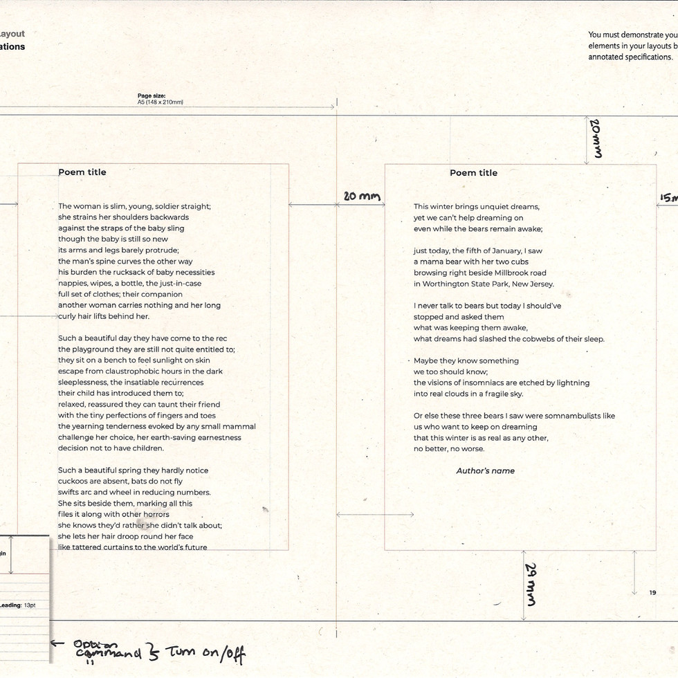


To create a grid of lines to show where the text would go we used a new tool to create it:

Indesign > Preferences > Grids

Set to relevant requirements. You can see behind the finished product.
Front Cover Design
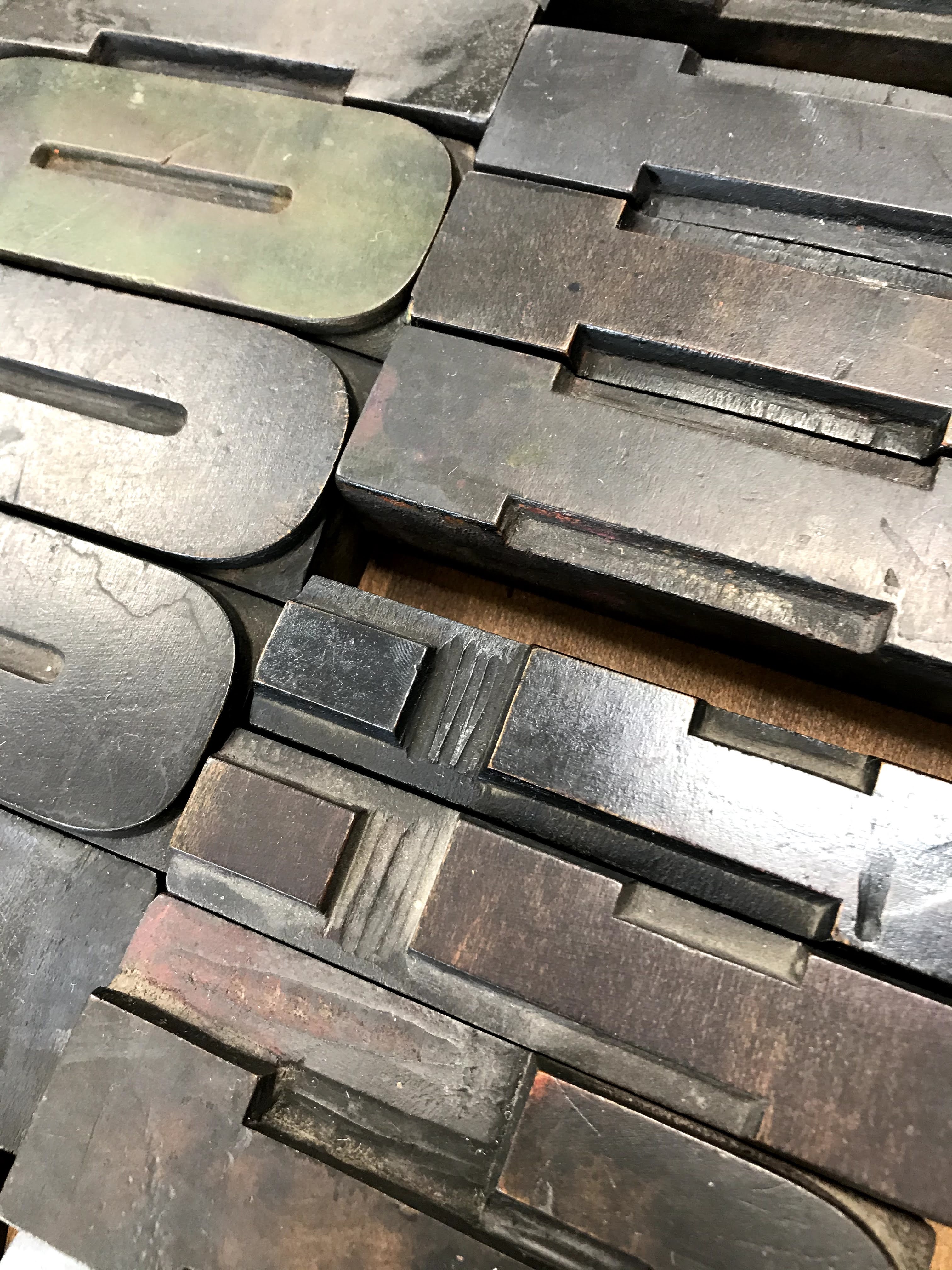
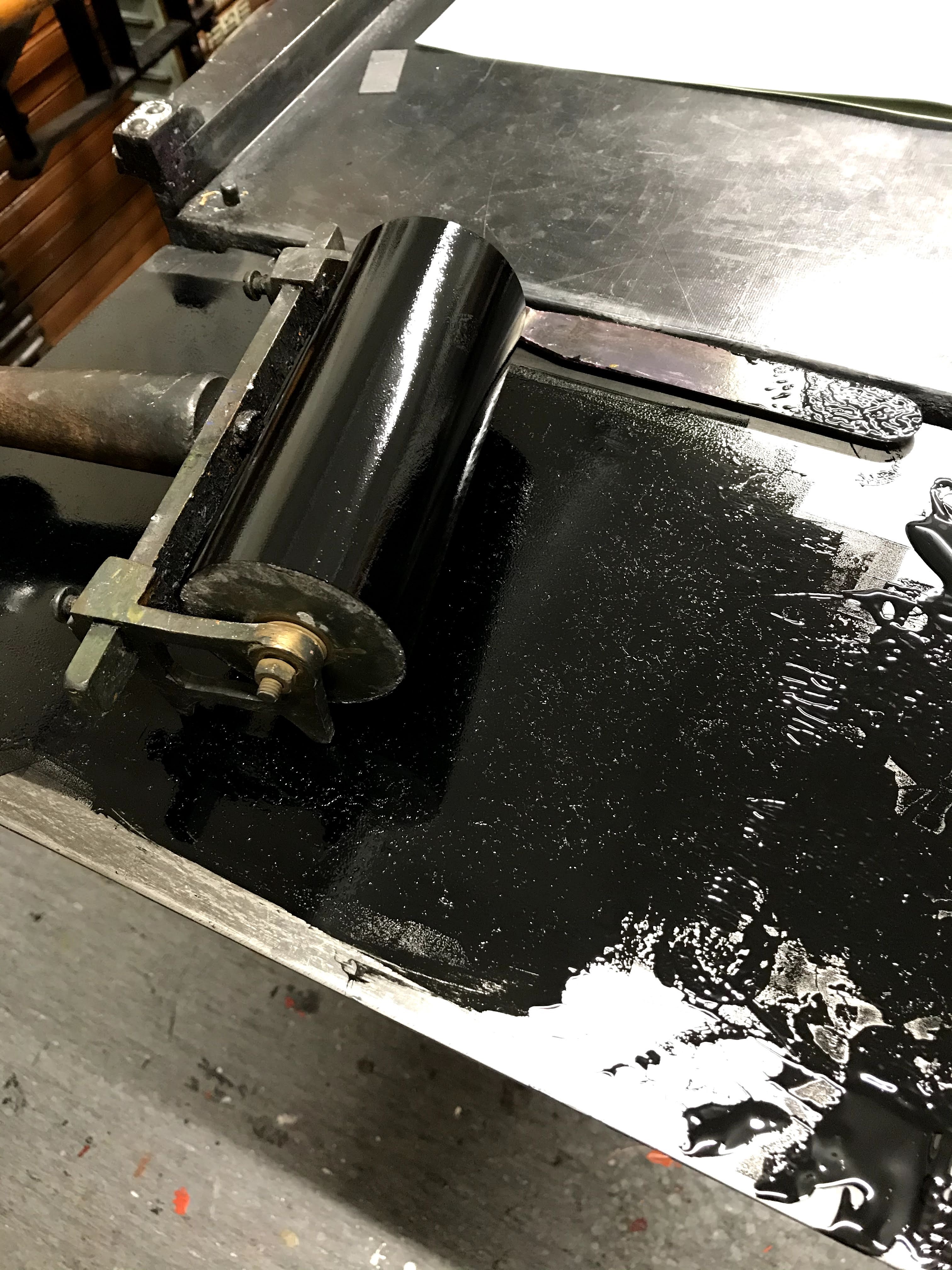
We then moved on to the letter press workshop and started to create our front cover design. The requirements for the front cover; Only to have wood type text (PlayBill and Condensed) , to be portrait and to have as much texture as possible. We then evaluated our previous designs of the cover that we created at the end of the last semester and discussed that we needed to be more 'rebellious' with our type and add more texture. With that in mind I set out to create many variations of the front cover 'Rebel Talk'.
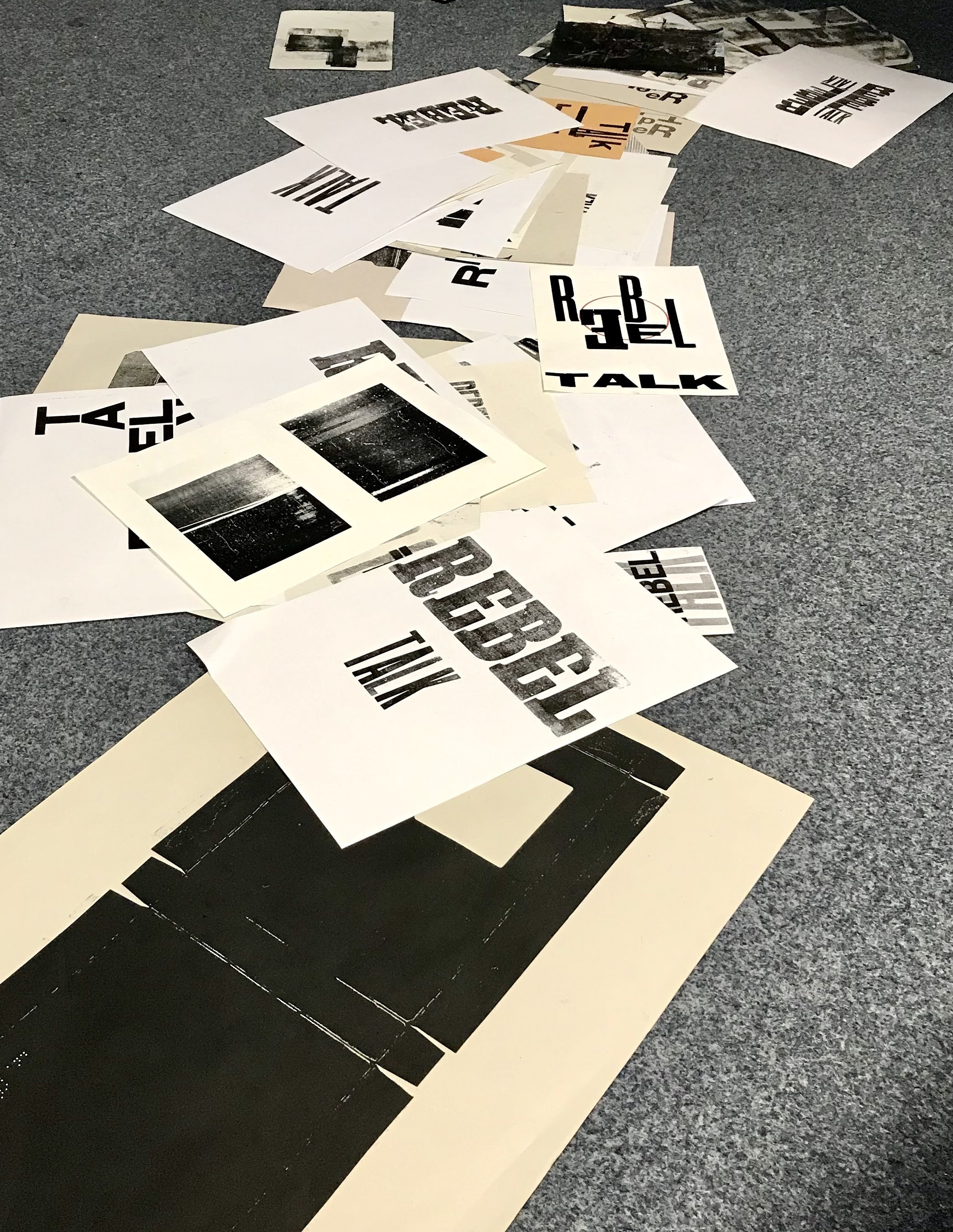

Evaluation of My designs


These prints I enjoyed creating. I had this idea to combine two prints to create an interesting contrast when it came to the idea of 'rebel talk'. Through out all my prints I have used 'Rebel' in the Playbill font and 'Talk' in the Condensed Sans. I chose Playbill for rebel because it was commonly used in old western films helping which were all about rebellious cowboys.

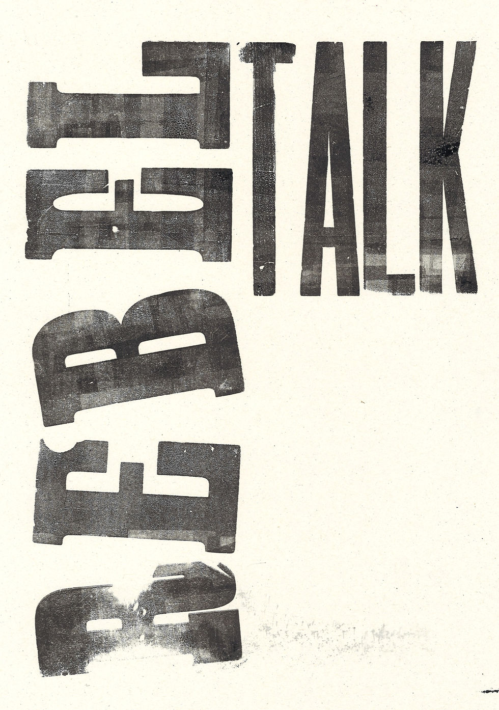
In these two prints I used a bigger Playbill font. I tried to choose letters which had many nicks and scratches. However I think I would like to have tried to put even less ink on the letters to add more texture. I made the 'Rebel' jumbled to make it look like the rebel is trying to move away from the constraints of the page.


These were my final designs that I created for the front cover. I used the 'R' as the main letter to make it emphasise the word 'rebel' . My favourite one is the print on the far right because it seems the most rebellious due to the fact that the letters are not stationary they look like they are moving. I also rolled much lighter onto the letters which meant there was an uneven spread of ink which created an interesting texture.
Facing Page Designs
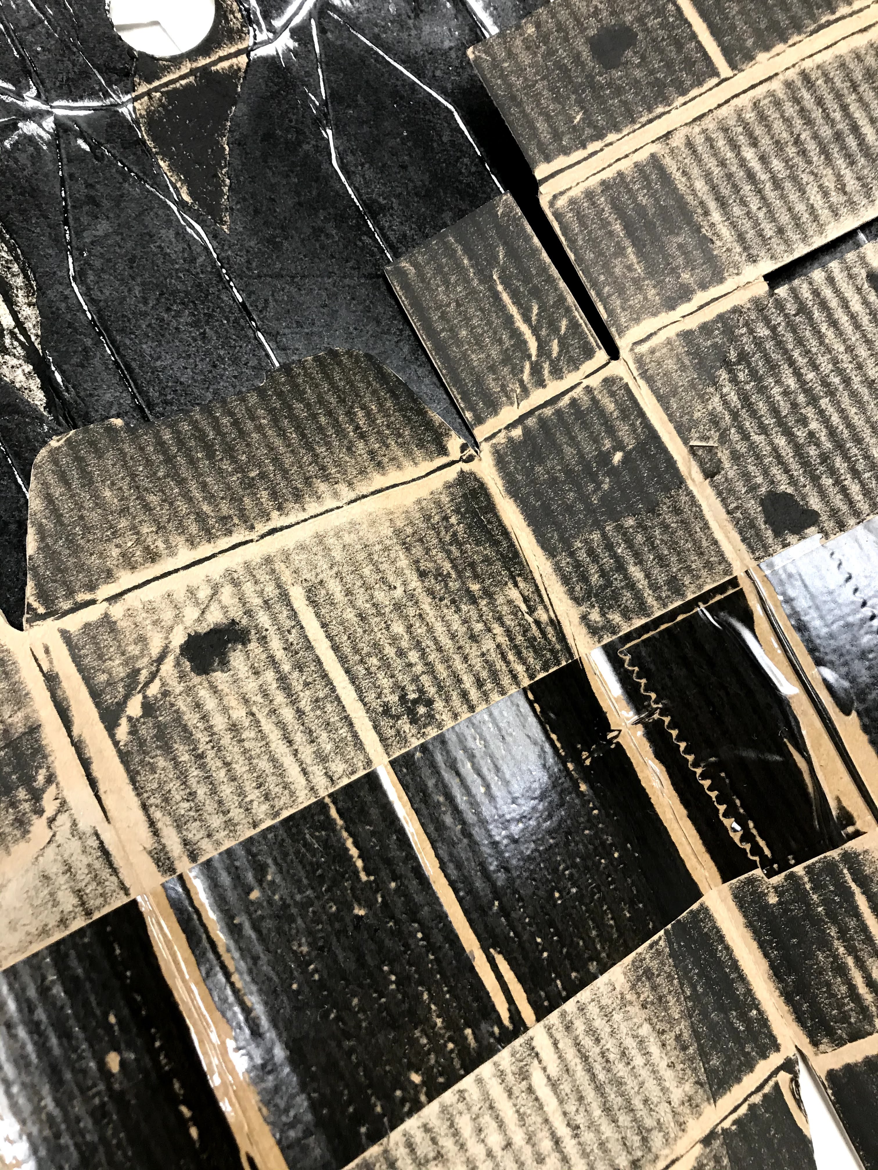
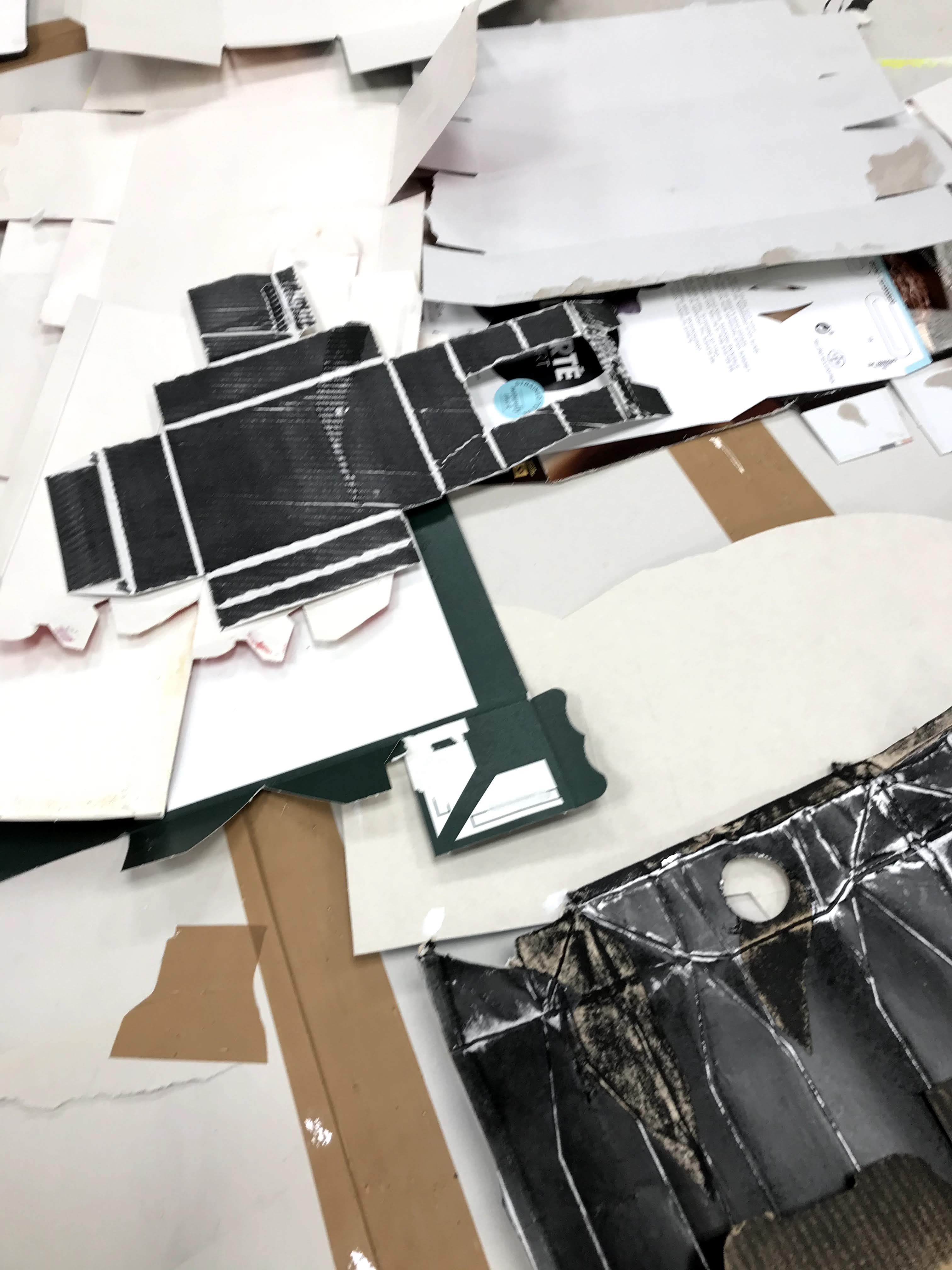
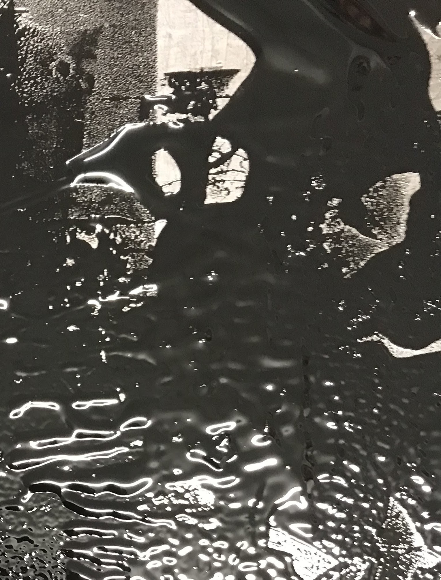
For our double page spreads XR do not want to use literal imagery but want to use print designs from packaging. Once again with texture, the plan is to slowly reveal through out the book that these textures are actually packaging.
My Designs


I used a risotto packet to create my packaging prints. What made me choose the package was because on one side had a circle cut out meaning I could create an interesting layering effect with the cutout. Through out creating these prints I used different amounts of ink and substrate to change the effect of the design such as using tissue paper instead normal paper. Using the tissue paper created interesting veins throughout the print. I also ripped the paper so the prints format was not just A4. Changing the form helped to change some of the prints from a geometric look to an organic look.
Research
David Pearson

David Pearson is a designer "specialises in print design where typography is the principle form of expression. David has been listed as one of Britain’s Top 50 Designers by the Guardian." In this book cover (above) he has used the relationship between type and image very cleverly. It shows clearly an idea of what the book is going to be about; a woman who in some shape or form cons the men she marries. This is shown through leaving out the 'o's' in the words, alongside the hand pinching one of the 'o's' and the two other on her finger signifying wedding rings. Pearson used the 'o' as a means of imagery as well as type this is some thing I would consider in future designs.
SPIN Design Agency

SPIN is one of the most successful design studios in London they specialise in typography. In this specific case the company 'Apple' commissioned spin to create a series of typography saying "Today at Apple" that would go up on screens in their stores. What I love about this work is that it takes a while to see the actual word in the first instance it is all just a bunch of shapes. The brief stated on SPIN's website; "to create two bespoke and inspirational pieces of art". Once reading that you can understand why the type is so different and difficult to read because it is also seen as a piece of art. In this art asymmetry is a massive element because it moves the type from just being type to being an image. In this case SPIN's design and Pearson's design is from similar because they blur the lines between type and image.
Ed Ruscha

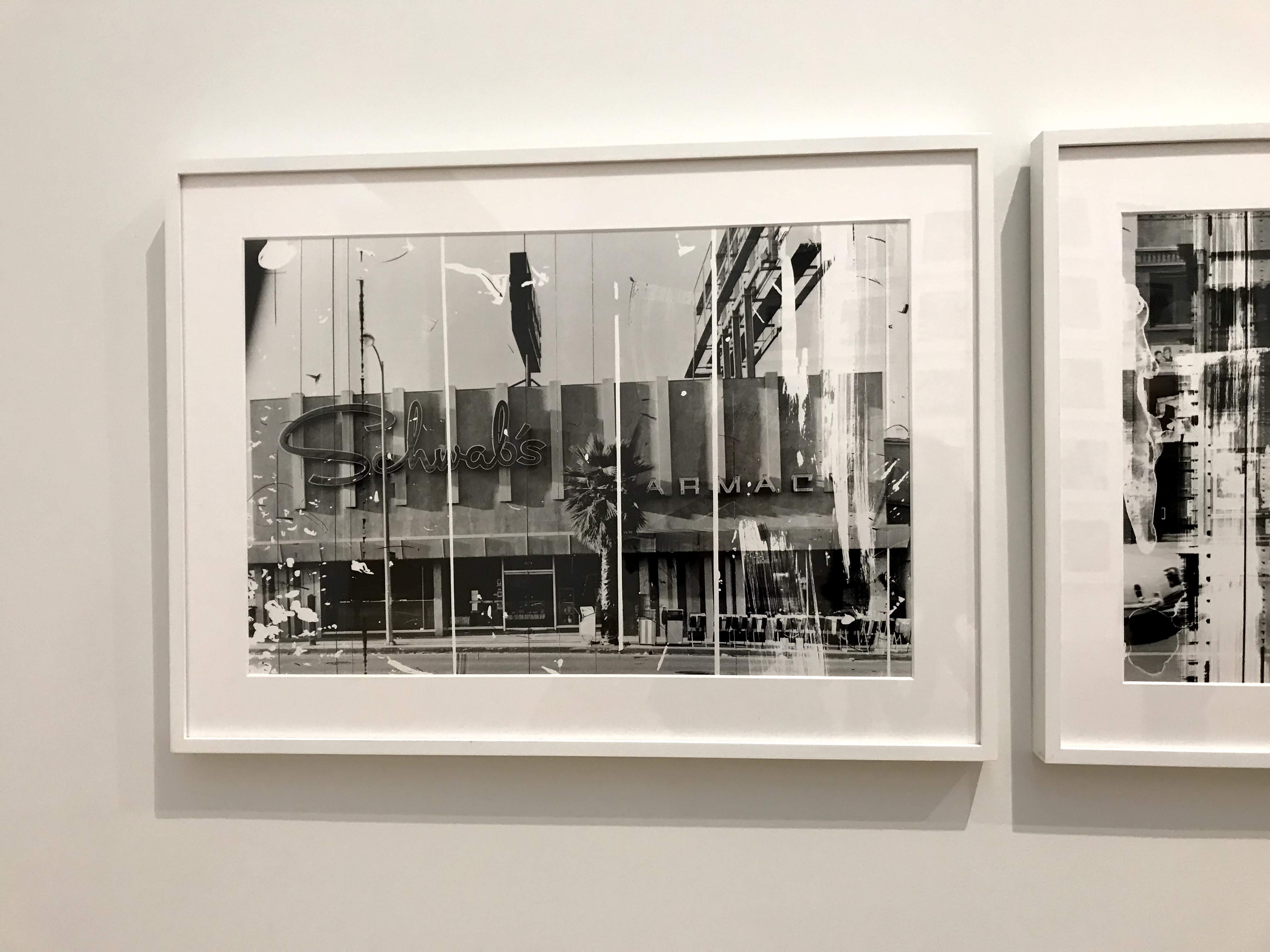
From visiting the Tate Modern in London I saw many works of the Graphic Designer Ed Ruscha work. I realised that these photos (Sunset Strip Portfolio) were relevant to my front cover and facing page designs. He took photos of the Sunset Strip in LA and then developed them into a book Every Building on the Sunset Strip 1966. And kept the negatives of these photos and in 1995 he took razor blades and sand paper to the photos and distressed them. Creating a rough texture and movement in these images. This is the same look XR are looking for in our type and package designs. To make it rough he has used the contrast of the razor blades lines and the circle of the sand paper.


Comments