XR - Chapter Titles Development
- Feb 20, 2020
- 1 min read
Updated: May 6, 2020
As continuation on the previous post I moved onto letter press with ink to create the letters for the chapter title 'Fear'. I tried to explore different ways of placement of my text to convey fear.
Letter Press


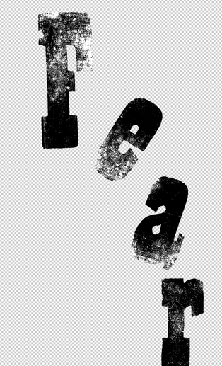


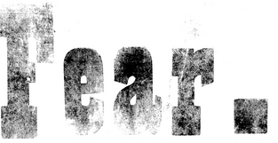


I experimented many different ways. I used the edge of a piece of paper to create a texture on the letter that makes it look rough and unfinished similar to the emotion of fear.
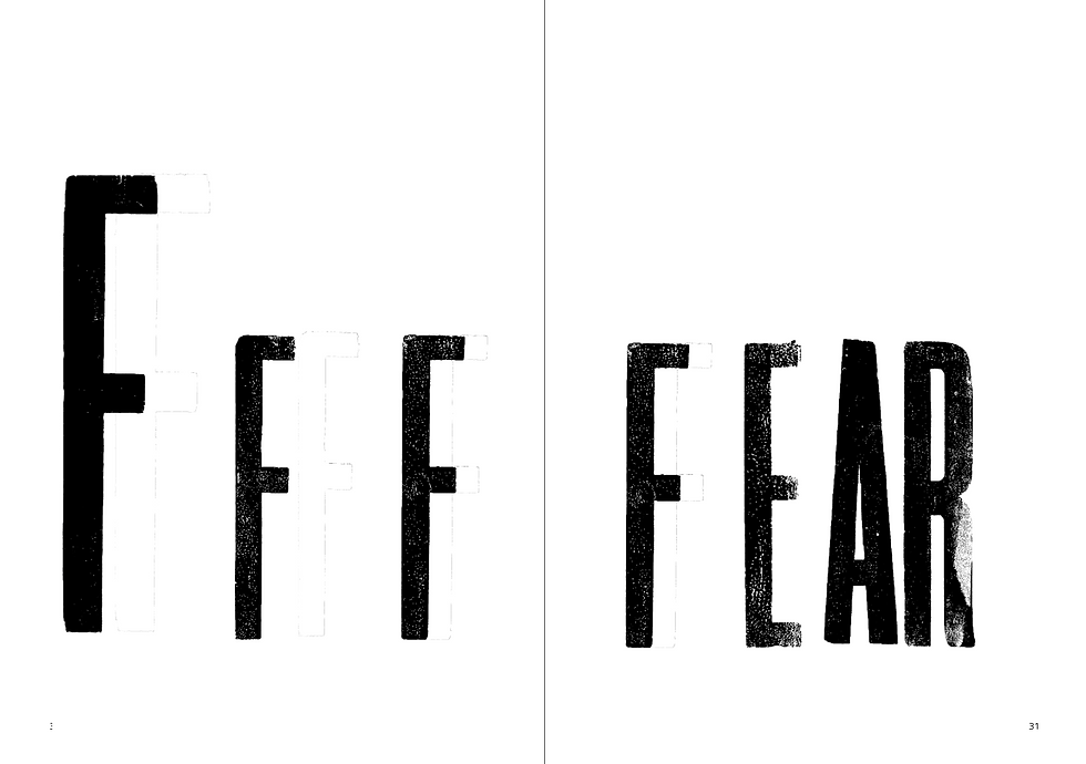
I the moved onto putting the type onto a double page spread as it would be in the book.
Final Design
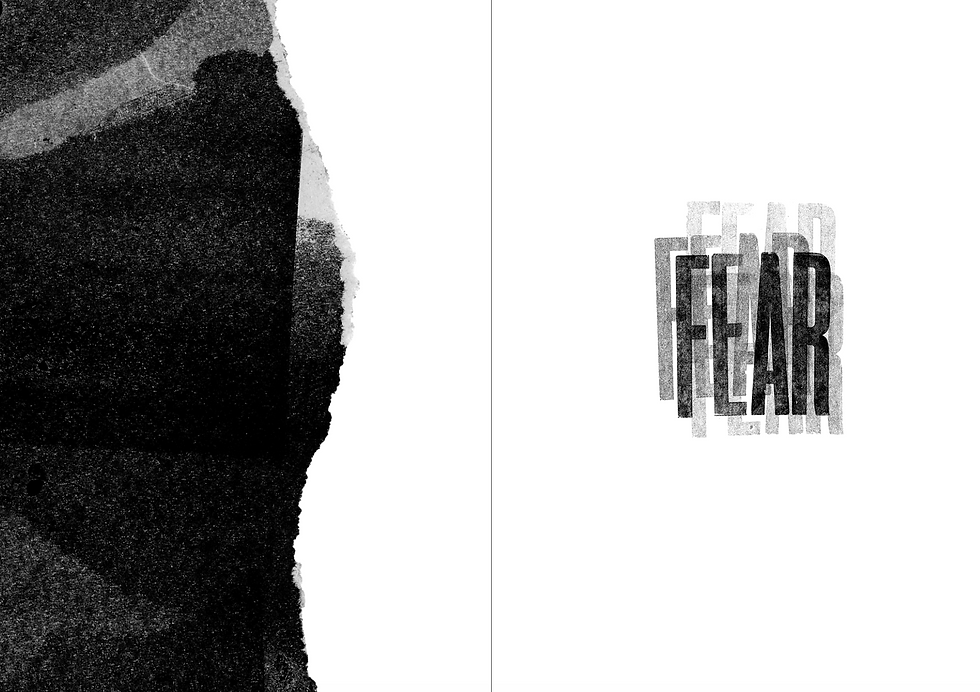
I finally chose this design I made the word fear look like its trembling through the different saturation of ink creating this idea of movement. On the facing page I added this mono print and the ripped edge is shaped it looks like it is a wave moving across to catch up with fear. linking to the climate change emergency which is what this book is all about.


Comments