Typography - Zine
- Nov 27, 2019
- 2 min read
Updated: Dec 9, 2019
After doing my research I moved onto the first element of my Zine - Typography - Inspired by Kiosks Ideal science Zine (spoken about in my previous post) of only having two typefaces i.e. keeping it simple. I focused on two different type one for the inside 'the map' and the outside 'the cover'.
Victorian Typeface
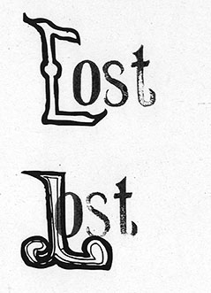
I started on the story book font for the map. I knew I only wanted two words 'Lost' and 'Found' because it was all I needed to describe my narrative. After researching Victorian font I decided to start on the first letter of each word the 'F' and the 'L' because the first letter in each word in the Victorian era was the most decorative.

After Drawing them I scanned them in and sent them to my computer to try and join with the fonts on the computer. However, it just did not seem right the letters did not quite fit. So I tried a different method I letter pressed. this was mainly quite successful I knew that my letters worked better with serif typefaces.

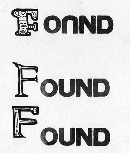

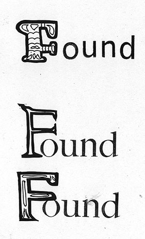

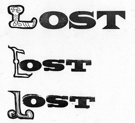

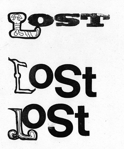
After trialling different fonts for a bit mixing both wood type and metal. I came upon a wooden font in tray 5 which seem to work perfectly for the style I was going for. So I added it in front of my letter and I soon realised that it on its own actually was better than me having a ornate letter in front.


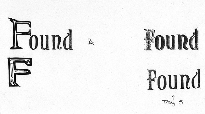
Moving on I tried the font on its own but with embellishment outside and around the word similar to Joe Biel's work (spoken about previously) which created the same feel as having an ornate letter in front moving forward I will used this style for my final design.

Child's typeface
This typeface was a little bit more easy to create through looking at my research I was able to copy with my own and writing to create a child's font. I found if I pressed down hard and held the pencil like a stick I would be able to recreate the font. I tried different media and font the felt tip pen font was the best.

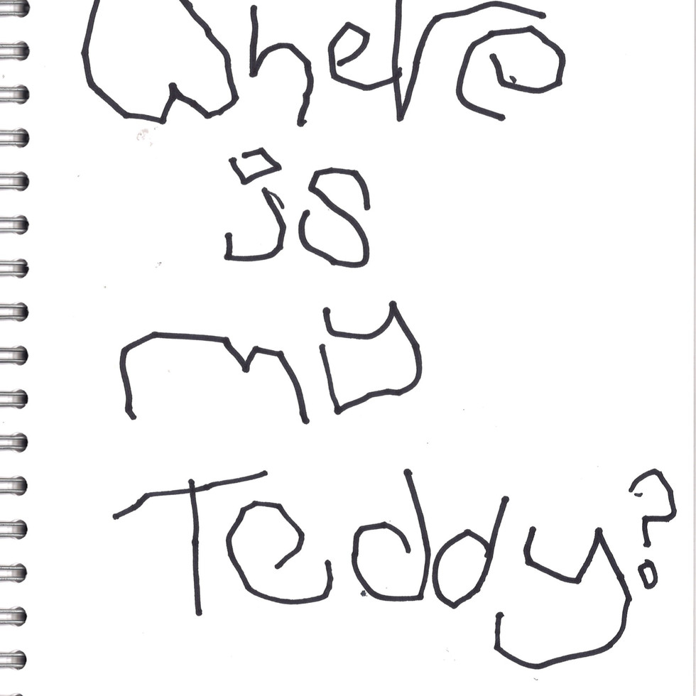


Moving on I think for the back ground I may over lay a thick black pen of 'where is my teddy?' on top of the written words at the back because it could create some interesting contrast and almost make the type an image. I will continue using the felt tip pens and I may also use a crayon for writing as well to help back up this Lo - Fi aesthetic.


Comments