Zine - Initial Research
- Nov 6, 2019
- 4 min read
Updated: Dec 9, 2019
Make a Zine by Joe Biel and Bill Brent
This book is all about making Zines it gives many suggestion of how the to start a zine alongside the zines history and methods you could use to create a zine. One thing the suggest is to wok out all the words and graphic elements before you start laying it out on a page.
"Effective use of white space tells the eye where to focus. ... Creative use of white space excites the readers" (p.110 - 11)
It states here how the zine should be simple in layout when starting to create one and the use of white space is pivotal in creating a clear visual message to the audience. The refers to keeping it simple even more by stating that making sure there's at most 2 typefaces on page making it cohesive (p.113).
"Group similarly created images together on a 2 page spread. Don't mix clip art, a pencil drawing, and a photograph." (p.121)
This is useful for me to think about once I collate my images how I want it to be put altogether. The main thing I want is this story to be easy to ready and a child could understand it.
Imagery
Fairy Tale books
I want to have imagery that is similar to the old fashioned fairy tale books. Because the teddy is lost and is trying to find its owner as if I child has imagined up this story. I wanted help communicate this through giving it the feel of a fairy tale.

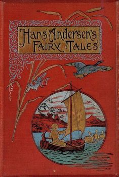

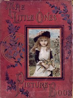

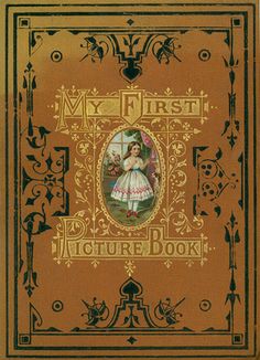
I would like to be inspired by the imagery and the type of these books and add these elements into my design.
Job Wouters
Job Wouters is "a practitioner of the lost art of psychedelic and delirious penmanship" he designs his own typography that is reminiscent of Victorian type and using bright colours he makes them similar to the 60s psychedelic style. I find his type interesting however I am more interested in his patterns that he creates with the same penmanship he uses for his type.

The simple of two tone colours could defined be something I could explore and create my own style as it would link nicely with the photographs I previously took of my teddy.
Brooke Van Der Linden
Through looking at the website TooT (an art gallery with a special interest in zines) I found an relatively unknown artist called Brooke Van Der Linden she experiments in collage and using strong colours to create a visual language.

I definitely want to use collage in my zine however I want to make it simple which is why Brooke inspired my because most of her designs are very simple.
Type
Rollo Press
One of Rollo Press's out of print books 'This is not My Son' Is interesting in the fact that the only words, the title, contradict the pictures of the book. As the Title Says 'This is Not my Son' creating a sinister tone as you wonder who the little boy is that is photographed in the book.

Kiosk
Looking on their website Kiosk has a number of Zines you can buy the one that interested me most was the 'Ideal Science Zine' I liked their simple use of typography to clearly get their complicated ideas across.

They only use two colours and typeface making it easy to read and view this is something I will consider when creating my own zine.
Jessica Hische
Jessica Hishce is a type designer. She has worked on many projects especially the one with Penguin. Where she designed type for the cover of a classic book.

This script typeface is something I would like to include in my own design to create a fairy tale feel.
Formatting
Poster Zine
posterzine.com is a company that creates zines that are also posters twice a year. Their formatting is interesting because it can be read like a book but when it is folded out it looks like a poster. I am considering what format I could choose and I like the idea of how it is two things in one and the elements change as the page folded open to a poster.

My idea is maybe I could make my zine folded from a map because the teddy is lost and is trying to go on a journey to find its owner a map is a way of helping to communicate this.
Map Folding
Through researching map folding techniques there are many different ways I could experiment to create my Zine through reading Stephan Angsüsser paper on map folding techniques he shows the many different variations have been used throughout history.

To move on from this I will experiment the different folds that can be made and see how that can translate to my own design of my zine.


Comments