Typographic Research - Zine
- Nov 17, 2019
- 2 min read
Updated: Dec 9, 2019
Child's Hand Writing


I am planning to make the font at the back of my Zine a child like hand writing. I will do this hand written due to anything online it wont feel that organic. However I am having to do research on what their handwriting looks like in order to make it believable.
I am also going to experiment with what type of pens I will use. Because looking at the images of child hood font the utensil used seems to make it more realistic. I will experiment in my sketchbook to see which is better; crayon, felt tip pen or pencil.
Göran Söderström and Daniela Juvall
Through researching Children's type I found an interesting project conceived by Göran Söderström and designer Daniela Juvall.
"Given the rising problem with gang-related crime in the more deprived half Östbergahöjden, the City Museum wanted to stage an exhibition that brought people together, documented local and aural histories and inspired pride in the suburb. "
To create the branding for the exhibition they used the children's handwritten type from the local youth centre to include the children of the area in the exhibition.


Victorian Type face
Lommen, M. (2012). The book of books: 500 years of graphic innovation. London: Thames & Hudson.
Jean Midolle (P. 244-5)

Jean Midolle was a Victorian type designer and experimented in using different lithographic printing techniques to create different coloured lettering. What I like about Midolle's work is the different use of typeface and colour similar to the story book styles of the day. This is a typeface I definitely want to be inspired by.
Victorian Gift Book (P.258-9)

Here I mainly interesting in how the type is placed compared to the illustration. Each section of type seems to be nestled in a section of illustration. This relationship I will definitely consider when creating my own design.
Gottileb Haas Sohne (P.242-3)
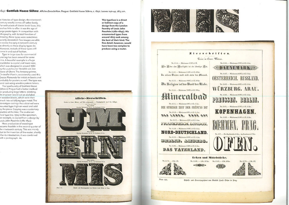
The main thing I can see from this typeface book created by Sohne is that serif typeface with illustration inside is a important element in creating the Victorian story book style. Illustrations in the corner is also popular something I will consider in my own design.


Comments