Screen Printing workshop 2
- Oct 16, 2019
- 2 min read
Updated: Nov 11, 2019
In this workshop I continued to add layers on my designs. The aim for this workshop was to be more experimental. It felt easier to be experimental in this workshop because I was more confident in the process. So through out the workshop I used many different colours and textures on the screens to start creating new designs.


In this Image I started to print over the flower that I had stuck down. When printed on this it created a interesting texture adding to the distressed look of the print.
In this print I printed on one of my spray paint backgrounds and used some of the same tone colours. Which the effect creates more texture and depth helping to bring out the darker blues. To continue with this print I might add some foiling to make it eye catching,
In this print I tried to be as simple as possible and used different colours o layer on top of the image bellow creating new tones and textures.
In this image I used a spray painted triangle to bring forward the texture on top. Both were quite scrappy the green bellow was the wrong ink and so came out quite bumpy. The 'x' on top I some how shifted the screen so the ends were smudged. Together though, they seem to work. I am going to keep on trying to add more onto this image.
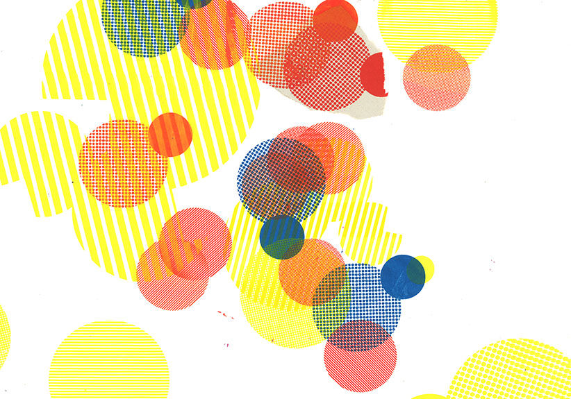
This is probably my favourite print because there is a lot of movement to it it looks like each print could jump out at any moment. For the splatter I used two different inks dotted around the canvas to create a marbled effect. It create more a striped effect however it works with the linear lines I put on top.
Research
Next week Neon inks will be used so I researched Dogboy a designer who predominantly uses these inks in his works to create something quite psychedelic and illustrative.


Comments