Letter Press Workshop 1 & 2
- Oct 9, 2019
- 3 min read
Updated: Nov 11, 2019
In the two workshops I started learn about how to create a meaning to not just the words on the page but the way I placed the words, what font I used, the spacing between the words and how colours also effect the meaning.
Workshop 1
To start off the workshop I was given a word 'Failure' to experiment with wood type. I found it quite challenging to know where to put my letters. However, once I had found the right spot I used a variety of different backgrounds some which worked and some didn't, such as just using a plain white background with colourful type set in the middle created impact and really emphasised the word. I then put black ink on top of a moody and dark page which meant the type just got lost in the page. In the first two prints that are seen on the slides below, you can see there is a yellow 'I' in the top fail. As the original 'I' didn't print well because the wood had shrunk, therefore it was lower than any of the other letters around. So to create a solution for this I took the letter out and printed it with my own hands this also let me isolate the letter making it stand out catching the viewers attention.


Research
While doing this workshop I also had time to research some designers to help inspire. I looked heavily at Anthony Burrill who famously created the poster 'Work Hard & be Nice to People' and how he used a simple black typeface on a bright background to help back up the strong message and meaning created by those simple words. I also looked at Erik Kessels and read his book about failure surprisingly called 'Failed It!' this helped me to understand and give me more of an idea of what I wanted to tell to the audience looking at this word failure, which is that everyone fails again and again. This was stated in Erik's book:
"Ever tried. Ever failed. No matter. Try again. Fail again. Fail better."
- Samuel Beckett, play write
I tried to convey this message strongly with overlaying failure on top of a woman from a magazine who had been photographed in way the made her look successful and strong. Making it convey that everyone does fail from time to time.

Workshop 2
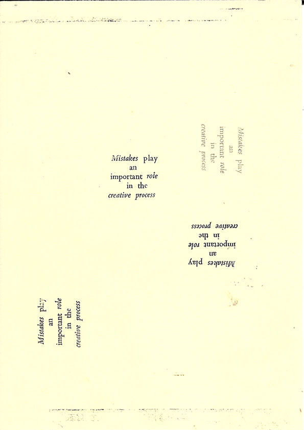
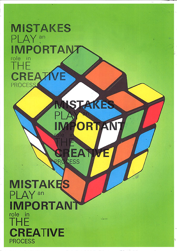
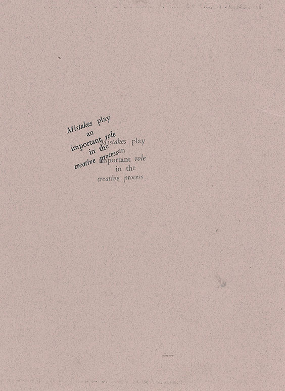
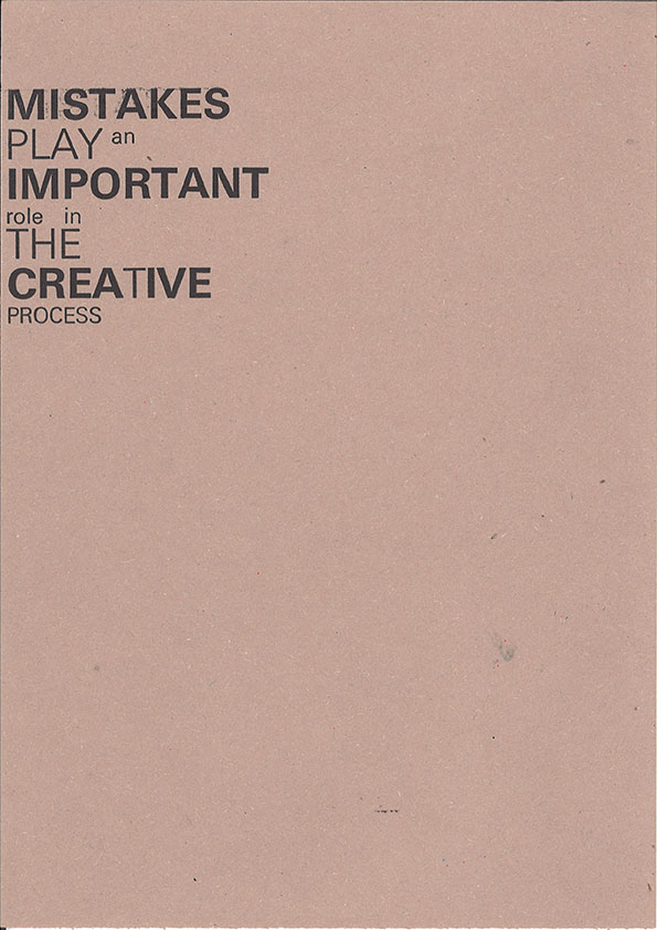
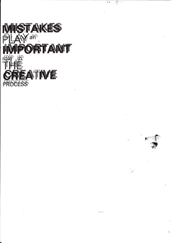
In this workshop I was given a sentence 'Mistakes Play an important role in the creative process' but this time I had to use metal I had to use metal. I found it much more fiddly due to the fact we were working Point 18 font size with was much smaller than the point 36 we were using in workshop 1. We were given six typefaces that we could only use; Bembo Italic, Bembo bold, Bembo roman, Universe italic, Univerese bold and Universe roman. I don't think this workshop was as successful as workshop 1 becuase looking at my final prints I think I played to safe due to the small font size and the limited we had (we only had an hour and half) next time I would want to experiment with kerning and font sizes. However, the one I think was the most successful was the print where I printed on top of a Rubiks Cube creating a relationship between type and image. The image gives an idea of someone trying hard and thinking and with the type it gives and idea that even when trying hard mistakes will happen once again backing up the quote by Samuel Beckett.


Research
In this workshop I kept on drawing upon the previous designers I researched in the first workshop. After workshop 2 I researched the type designer Paul Elliman to help me think more outside the box because I was bothered that my designs were not that experimental. Paul Elliman was the right man to look at he creates his own fonts from disused materials he may not be a printer but he pushes the boundaries when it comes to the idea of font. This has inspired me a lot to go forward and further develop my letterpress designs.


Comments