Initial Typographic Research
- Jan 19, 2020
- 3 min read
Updated: May 6, 2020
In the upcoming module we will be focusing on typography. This post will be initial research for the module to help inspire me as I get to know more about typography.
Typographic Examples
Successful
Example 1
Peaky Blinders, (2013). [TV programme] BBC.

This typography is for the TV show Peaky Blinders a gritty crime TV show that centres on a gang in Birmingham in the early 1920s. This type is successful in describing the theme of the show because of the use of wood letterpress meaning that the letters are not perfect they are rough and textured relating to the grittiness of the show. It is most like 'Clarendon Condensed' as stated in this article. This font is a serif font meaning it has more connotations to the past thus relating this is a period drama.
Example 2
Ben Cannon, Viewfinder Film Festival poster, 2006
Ingledew, J. (2011). The a-z of visual ideas. London: Laurence King, p.35.

This is a poster for an independent film festival View Finder. I think it is successful, the typeface is unique showing it is a independent film festival i.e. the films you are going to see will be one of a kind. The poster is created from a series of long exposure photographs of people creating the words (you can see a outline of them if you look close). The sparklers make the film festival seem exciting and bold. But also the connotations with sparklers that they only come out during a celebration with other people. Telling the viewer that this will be a festival you will not forget. (Ingledew, J. (2011). The a-z of visual ideas. London: Laurence King, p.35.)
Example 3
Poster By Áron Jancsó (2008)

This poster by Áron Jancsó is successful because he has used type to create an image. Using a imaginative take on type and actually creating it into graphic art work this style I would like to experiment with. He used different point sizes to create the illusion of a man (the bigger point size) and then the illusion of movement (the smaller point size). He also varied in justification helping to create the illusion of the image.
Unsuccessful
Example 1
Fish and Chip shop sign
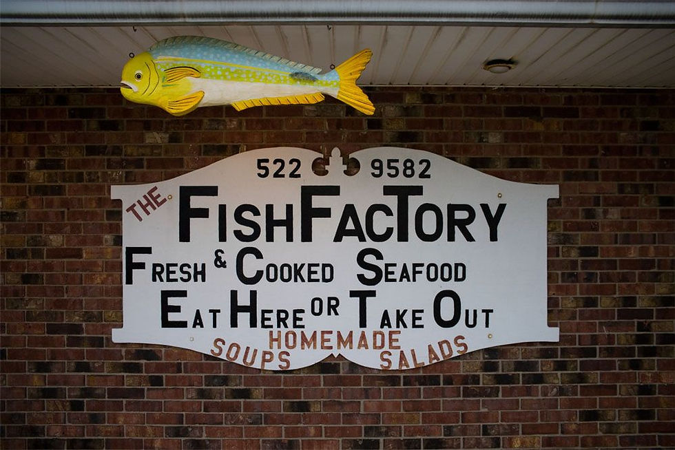
The typography on this sign is unsuccessful due to the variation in kerning i.e. some letters are too close together and others too far apart making it difficult to read as the rhythm is disrupted. Also the fact that there are so many capital letters makes it even more difficult happily read. The justification of the lines are also in the wrong place because they are not balanced making it uncomfortable to read.
Example 2
Poster for a comedy tour (2010)

In this poster the type is unsuccessful because there is too much going on. There are too many different colours, point sizes and drop shadows. Too make it easy to ready it is very difficult to know where to start with the issues of this poster.
Book Sleeve Examples
Example 1
Jon, R. (2012). The Psychopath Test. New York: River Head Books.

This is an interesting book sleeve what I like about it is how it looks like it has been ripped to uncover really what is in the book. I like the utter contrast between the monochromatic left side to the bright neon right side. The left side is calm through the use line creating a boarder and the serif font. The right side is bold and moving though the use of font that is not one singular line and the boarder is created of different length diagonal lines. This will inspire me to create something is very juxtaposing but still works together.
Example 2
Rahim, K. (2015). If You Think I winked, I Did. Studio Vanessa Ban.

This book which was created for an artist Khairullah Rahim to display his work. I found the sleeve very inspiring and interesting because Venessa Ban the designer used a different substrate to create the sleeve. Over all it is very simple but the fact that is on the clear substrate it means that it is interesting because you can see what is underneath.


Comments