Image Making
- Oct 2, 2020
- 3 min read
In this second lecture we started to think about documenting typologies. We used four different techniques in this lecture; icons, illustration, illustrated type and montage.
Icons
An icon is a simple reduction of an object such that it is instantly recognisable for what it is.
Susan Kare

To start off we looked at some design from Susan Kare who created the first icon for the Apple Mac in the 1980s. She used the same method that we used in the lecture, using graph paper and a pen use the boxes to create these simple icons. The command icon is still used today on the keyboard of a laptop/computer.
We were given an icon to draw the fuchsia seen on the right of the image:

I found this fairly challenging to wrap my head around but it was a good exercise as it made me observe the flower more.
Illustration
An illustration can pass beyond the physical boundaries of a photographed object and thus, can emote and elucidate ideas in a way that a photograph cannot.
Filipe Jardim

We looked at the works of many illustrators but the work that stood out for me was Filipe Jardim. He used the medium that we were using brush and ink to create loose designs. I especially like this book called 'Sketches and Snaps' where he combines the use of his photography with a linking sketch through illustration. It is signifying the difference between a photograph (detailed and matter of fact) and a illustration (loose and emotive).
In this section of the lecture we were given ink and a brush, to illustrate the fuchsia. We also used words to technically label the fuchsia. Like and old Victorian botanical drawing.

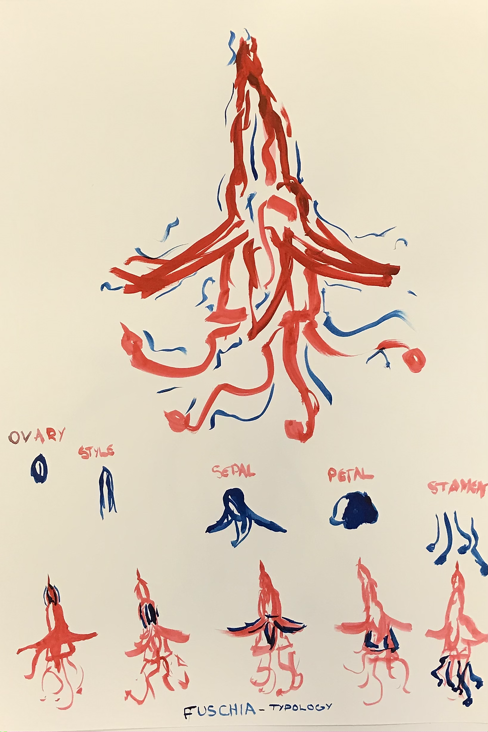

I was pleased with sketches I created at the start I was quite tight and not that loose but by the end I felt better at doing it I think if I keep on working at my illustration I will get close at creating good designs.
Handwriting styles
From hand-drawn with a pencil or sharpie, to knitting and stitching, it provides the opportunity to express your creativity and add your own personality to a design project.
David Foldvari

David Foldvari was a good example at showing how you can incorporate a handwritten style into a professional context such as the image above which is for a Nike winter sport campaign. It is interesting to see how a messy hand type to be incorporated into a cohesive design.
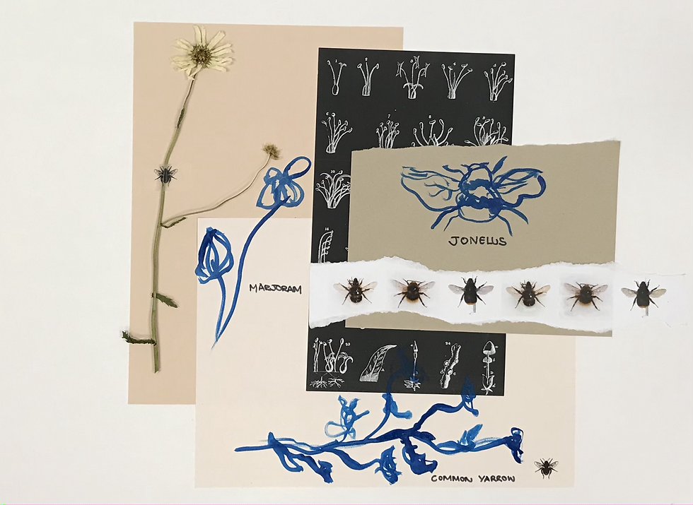
In this section we were given a list of names for wild flowers, bees and pesticides which can kill these species so I used this part to create some dissenting work. I tried to convey through hand written type how something like the pesticides can destroy this environment.

I enjoyed the casualness of this type I always thought I could only create a more formal type on screen and that handwritten type was not 'professional' enough for graphic design. T his was what I thought was one of my most successful designs of the day.
Montage
The technique of combining in a single composition pictorial elements from various sources; parts of different photographs, drawings using different materials or fragments of print or found image, either to give the illusion that the elements belonged together originally or to allow each element to retain its separate identity as a means of adding interest or meaning to the composition.
CY Twombley

Cy Twombley uses montage to linked images together such as these sketches and accurate prints of mushrooms. Linking these forms together helps to create its own story.
To create my own montages I used the previous skills we had used in the sketches alongside print outs of our subjects. This was the one that came the most easily to me as I had already experimented previously with the technique of collage. I did find it hard not to go too far and push the montage over the edge and make it tooo busy.


Comments