Glyphs - Specimen Book Development
- Dec 6, 2020
- 4 min read
To continue with my specimen postcards. I went and had a discussion with my lecturer. He encouraged me for the fragments; instead of having card that I cut out with scalpel which would not be too accurate, I could laser cut a thicker board such mount board. This is shown in the sketches below.


We also discussed that having a thicker material meant that I could still keep to postcard shape instead of having odd shape fragments flailing out of a slip case. And in the post card you would be able to pop out the fragments and create the poster.
Laser Cut template
In order to laser cut I have to create paths that are 0.25 pt wide. So to create the template I decided to create the look of the poster first and then move that lines that need to be cut out on a separate document.

For the layout I decided to simplify even more from my previous design and instead of having 12 fragments I have 9 and each fragment only shows the glyph and the sound. I have decided to have an explanation postcard to help describe the new language. I then moved on to put it into the post card template still with the Glyphs, so I could see what the postcards would look like separately.

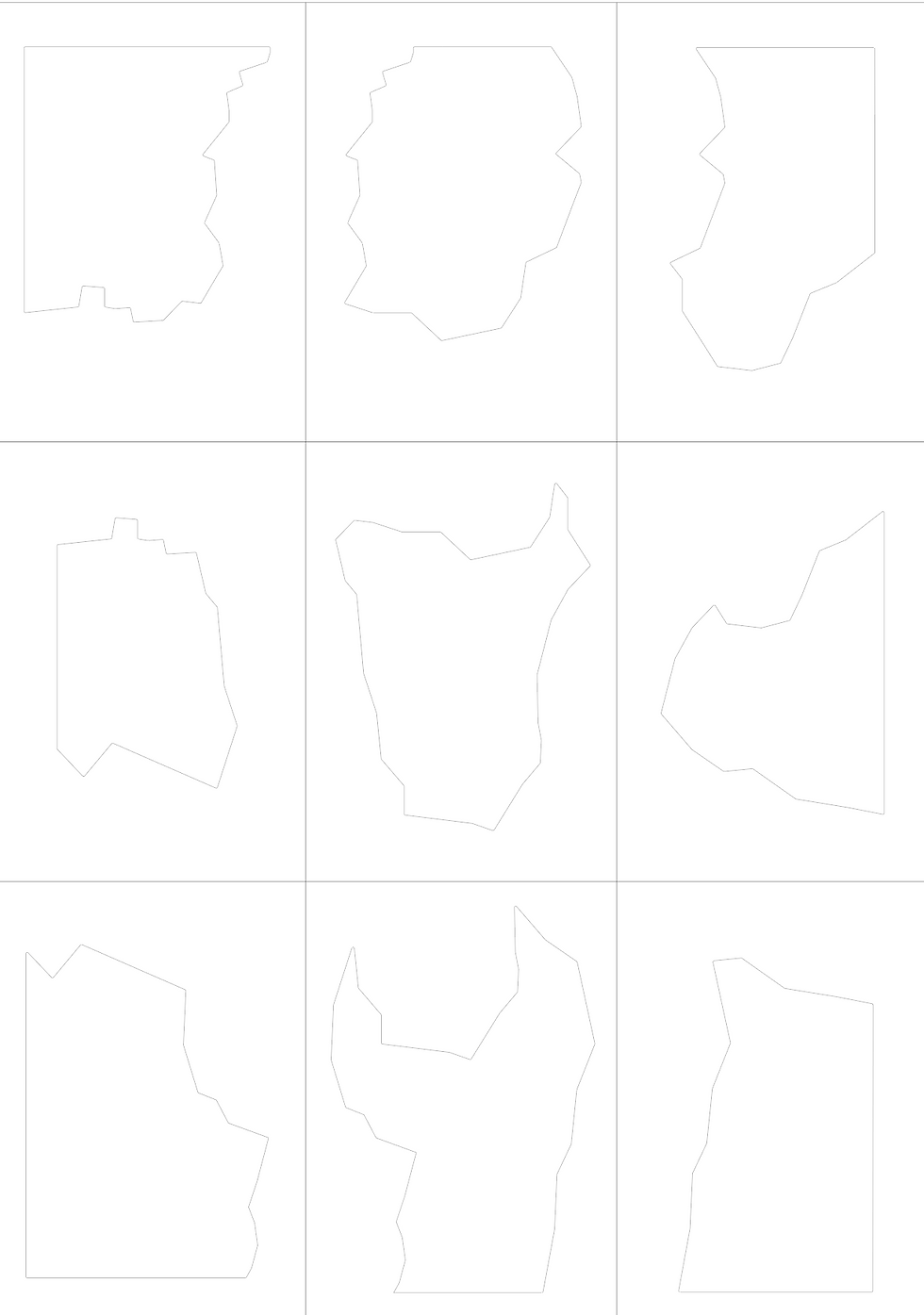
Above is the file I sent to David (the 3D workshop technician). I had to send it as a DXF file because that is the file that the laser cutter reads it only understands the line so I could not have any extra embellishments.

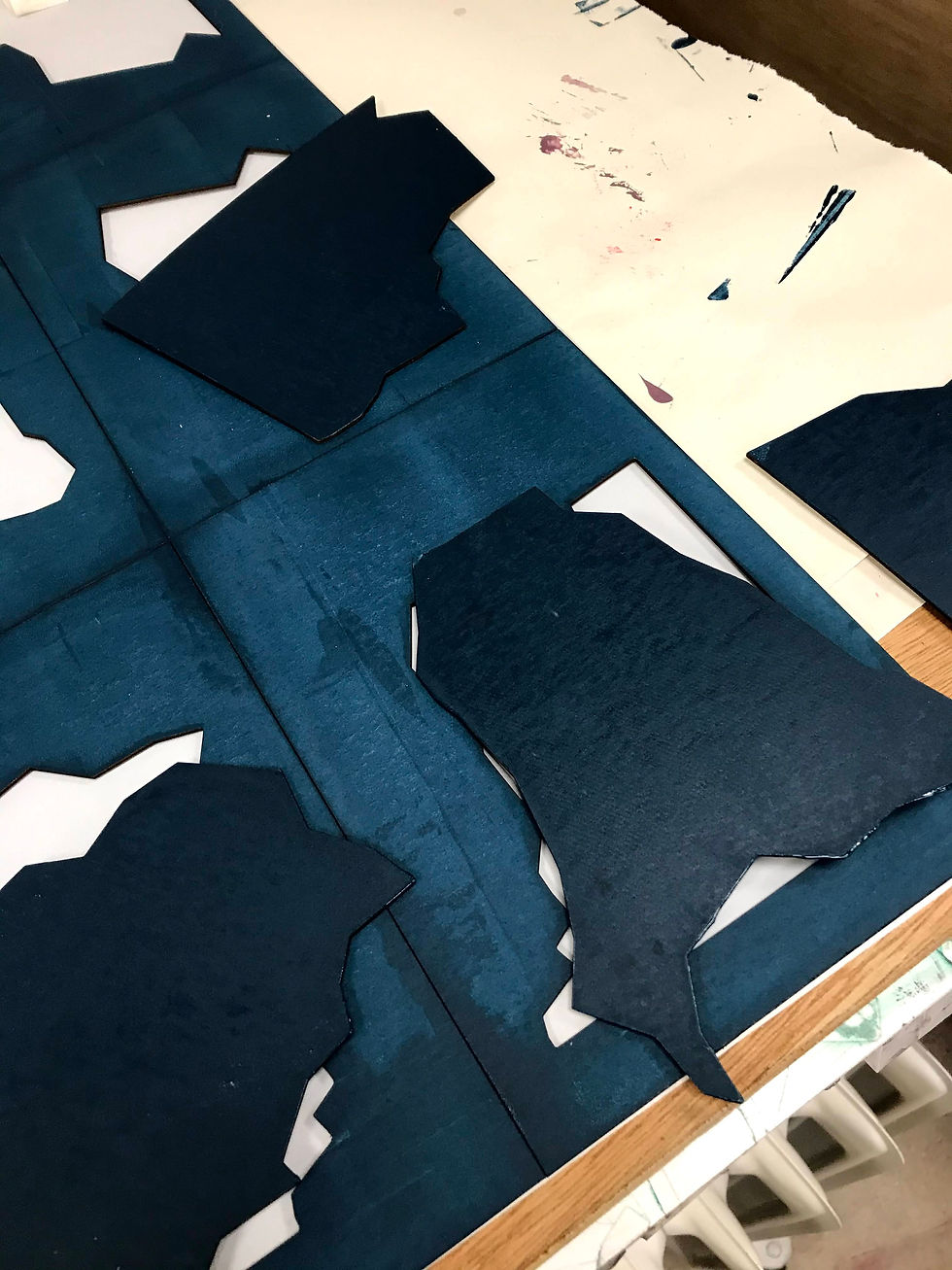
Above was my finished laser cut piece. I found when I tried to pop out the pieces they easily fell out and were not going to go back into place in the postcard. So I decided to just use the fragments and not the postcard outside. This meant that instead of the planned slip case I decided to make a box which could house the fragments.
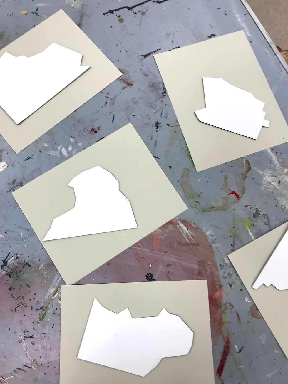
Screen Printing
I decided to screen print my fragments because that was the only plausible way it could be printed. To start off the screen printing I printed a background colour because originally I was going to use the colour of the mount board. But after the laser cutter there was a lot of charcoal which left black stains and was not very sightly. I decided to screen print a dark green/navy colour because I was inspired originally by the colour of Chinese Ming vases (a royal blue). But I wanted to make it subdued to put emphasis on the new language I had created so adding the dark green toned it down.
I originally decided to have two colours on top of the green, one a gold foil to put on the glyphs and then a simple contrasting colour for the sounds. So I created two screens.


I put a box around both screens which were the same dimensions as the outside of the postcards. Meaning when screen printing I could line everything up properly.

I did a test for the foiling just to see how it would look I used two techniques. Both used a glue that screen printed onto the substrate. However one (gold) was heat pressed on. The other (silver) was ironed. However, both did not provide good results because each stuck also to the base ink as well as the glue. Creating an unclear image. I knew I could not use this technique, instead I created a cream ink that I would use on both the glyph and the sound.

Here was the final screen printed piece.
Spray Painting
However after creating my design it became clear that my the back was messy and had splotches of ink. I decided to cover it up by using spray paint.
However spray-painting did leave white splotches on the front so I had to touch up the edges.
Making the box
After I had made my box I went to the bookmaking workshop and alongside the technician Ruth; I created the box. It was a lengthy process it took an entire day of work but I was happy with the result.

I started off by measuring out the exact pieces I needed to create the box. The material I used was 2mm board. I then had to cut all the pieces of board out to size.
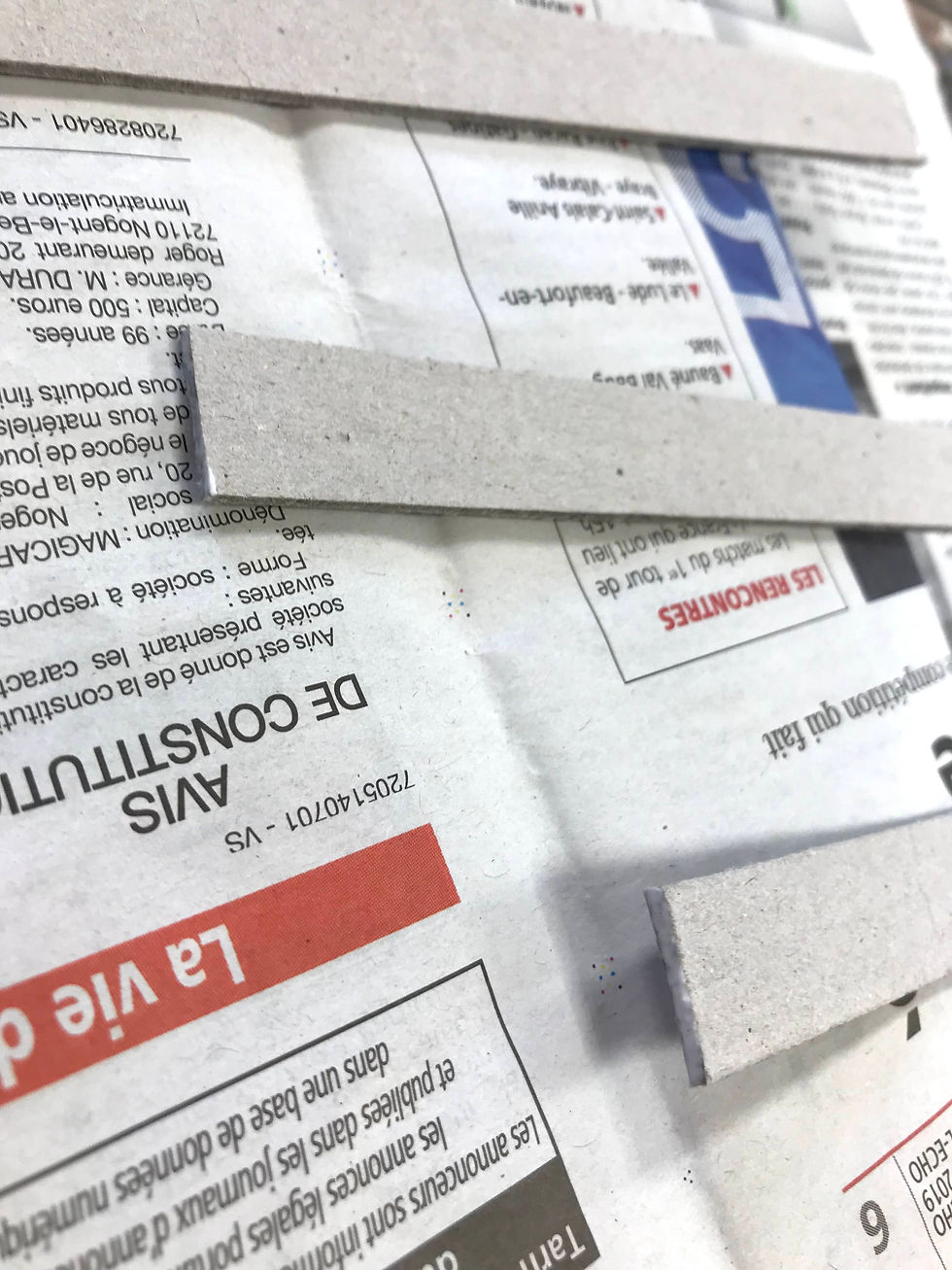
To stick the box together I had to create the wall of the lid and the base first. I had to glue the edge of each piece and let them dry for a bit. Then stick them together for added support stick small pieces of tape onto the joints. Leave this half an hour.

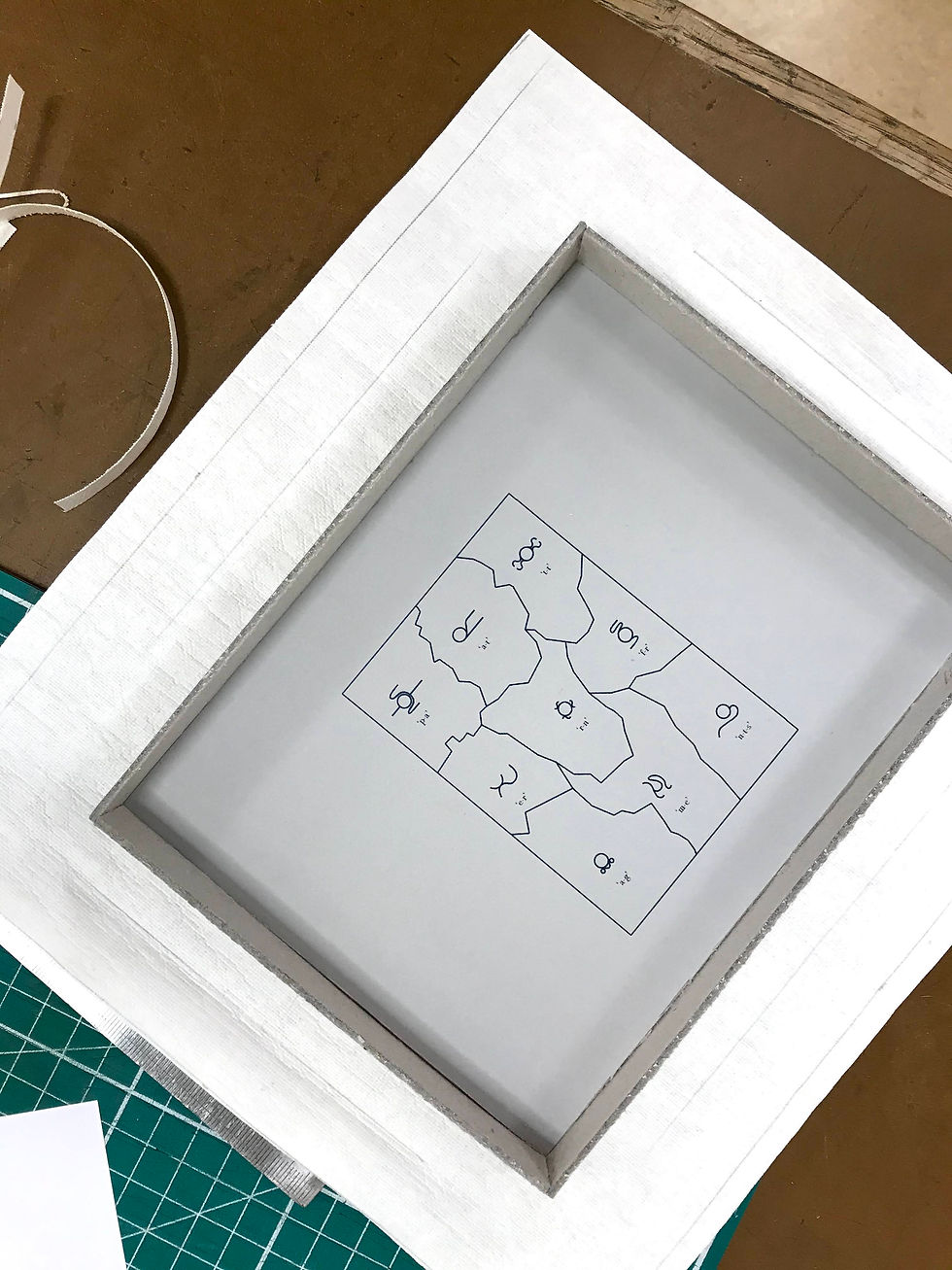
Meanwhile I had to stick the lining onto the base and ceiling of the board. Which I cut to size and used glue to stick together and let them sit in between boards and packing for half an hour. On the ceiling (the base of the lid) I also put a map of the puzzle so anyone using the puzzle pieces could put them together with the map. The map is just a smaller version of my first original template for laser cutting.
After half an hour stick the walls to the base, leave to dry. In the meantime I cur out the template for the outside material which will go on the outside and the walls of the box. I chose a hessian type cream fabric to help link to the glyphs.


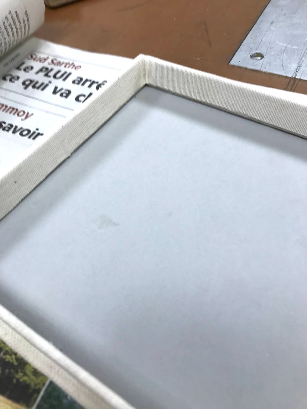
I then glue the fabric on to the box. After that I had one more thing to do which was using the heat letter press to gold emboss the lid.


Overview
Overall I was pleased with my final design. I made a design which was different but still displayed the glyphs as works of art. I was pleased in trying to keep my layout/design as minimalist as possible so the glyphs could be emphasised. If I were to do it again/have more time I would have screen again and more carefully the background colour and glyphs.


Comments