English Weather Briefing
- Jan 29, 2020
- 5 min read
Updated: Apr 22, 2020
To start off our new module we were briefed by a live client. The client was a representative from a small knitwear company English Weather. Founded by Gohar Goddard in 80s, it started selling luxury knitwear and eventually moved onto specialising in creating luxury scarves with the designs of Goddard's own paintings. It changed knitwear to scarves due to the fact that Goddard wanted to bring another passion into her company.
It is a wholesale company meaning that it sells to luxury boutique around the UK and US. They sell "wearable art".
The Brief
The Brief is to create a scarf design for English Weather for their Spring/Summer 2021 collection. We are to create the design in pairs and a winning pair will have the scarf produced in their Italian print mill and sold.
The scarves
The scarves are usually all Goddard designs and each collection is entirely different, many of the customers collect the scarves. 90% of the scarves don't really have a repeat pattern and are non-linear.
The Customers
The scarves are sold from £220 - £300. So they are selling for women (age 35-70) who are well off and are seen as flamboyant and extravagant. The main customers are Americans and each scarf has a versatile way of styling. Once again wearable art.
Things to consider
The season (S/S) we are to design for, the scarf's material is 15% silk and 85% modal meaning it is slightly more transparent, mass expanses of dark colours such as blue and black do not show up too well.
Dimensions the scarf will be square 140x140 cm.
Texture is another thing we should consider because in many of the scarfs texture is a key feature.
English weather want something new and innovative with variety.
Finally it is important to consider Hemming wether you want there to be a border or not.
Research
Previous designs


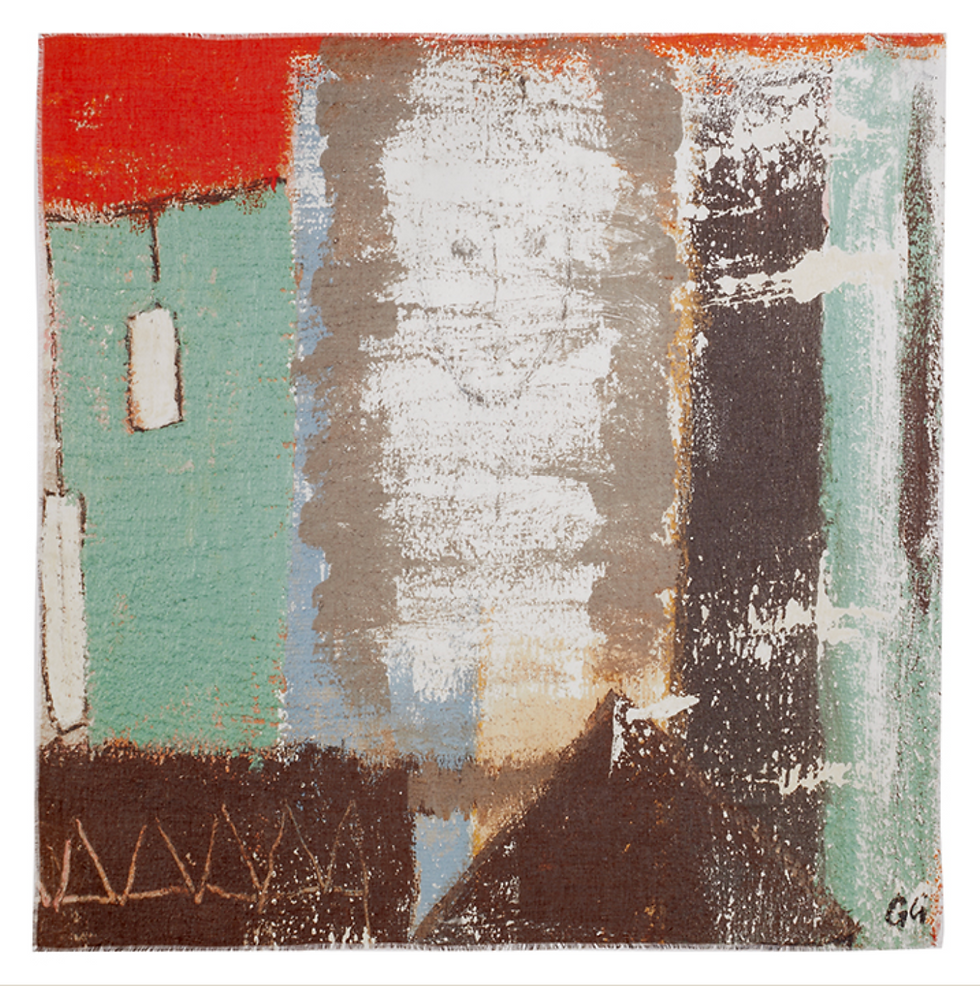
This pattern is on the bottom right hand scarf (above). Like most of the scarves this pattern is very abstract with the use of oil paint and pastel. creating a non linear design. The colour pallet is pastel as are all the others in the collection creating the sense of summer and they are also seen as quite grown up and modern, appealing to the target audience. A slight border is created through the use of pastel lines around the outside.
Both of these designs have a rough texture with colours dispersed unevenly through out. For our own designs we will consider distributing the colours across the scarf whilst still putting our own spin on the design. Texture is also a very important factor because it makes the scarf more like a painting (wearable art.) Thus attracting the demographic.
Competitors
Sabina Savage
Sabina Savage is another luxury scarf brand. However she differs from English Weather through her collections are themed (usually on animals) and uses the theme for many different items. Meaning they are less collectable than English Weather.


These scarfs artistically are different it is much more illustrative than Goddard’s with more regal colours used. It is also made of a silk wool blend so it is less transparent than Goddard's meaning that this is a difference we could emphasise by seeing how the colours look layered on top of each other. Savage is also inspired by more exotic animals and places where as English Weather is inspired by England and it's area.
Emma J Shipley
Emma J Shipley's brand is much more similar to Sabina Savage's, all her scarfs and her of homeware items are all created in collections so there is less variation. Both Shipley and Savage have a similar price point to English Weather (£200).

Shipley's scarves are linear and heavily based on pattern. Each have a strong border around them. Which I quite like the style of I think it helps to finish the pattern and the scarf making it seem more regal. Her inspiration is from mythical stories about animals so it is much more dream like and less abstract compared to Goddard's work.
Suzi Roher
Suzi Roher is another luxury scarf designer but she is different from Shipley and Savage she does not have themes or collections of pattern/prints. She is much more like in English Weather. She has different designs that are more abstract. However she uses photos to create her abstract designs.


As you can see each scarf is very different and she uses collage to create different and interesting designs. In these scarves pattern is more prominent than Goddard's designs. There is also less texture however overall all these competitors have made scarves which are wearable art.
The Designer
Gohar Goddard
Gohar Goddard never went to art school she was self taught. However she has had many influences for her art such as Henri Matisse, Paul Klee, Antoni Tapies, William Scott, Peter Lanyon and Roger Hilton.
“I am first and foremost a colourist. When I start painting, I begin by mixing colours, trying our new combinations of tints. I apply layer upon layer of these experimental pigments to the canvas, build up a texture that appeals to the touch... concentrating on the architecture of the paintings, line, shapes, and forms that give greater interest to the colours themselves. This is the drawing stage. I make marks, I try to impose some degree of order, I scratch hieroglyphics, I smudge the paint, I roll on new layers of pigment, all the time trying to create the greatest amount of visual interest with the least means."
The quote above is from Goddard herself talking about her process this is something interesting because it depicts the essential elements that we need to have in our design so it is linked to English weather, which is a strong sense of colour and texture and some from of irregularity in the painting to create an interesting painting.
Goddard's Influences
Henri Matisse

One of Goddard's early influences was Henri Matisse particularly the later part of his career from 1930 onwards where Matisse adopted a style of simplification still with a strong sense of colour which he has used through out his career. He was seen as a colourist for his whole career just as Goddard. However At the start of his career Matisse was also seen as a Fauvist which was a movement where colour was used to convey an emotion in the painting. This is something I think Goddard has used in her career to create interest in her painting. This maybe something we could incorporate into our design.
Paul Klee

Paul Klee is a Swedish artist who inspired by cubism and expressionism created many abstract painting and later in his career heavily studied colour theory. Influencing Goddard in creating colour that works together. He was taught at the Bauhaus school of art it is clear in all his painting that the bauhaus style of strong geometry is coming through and you can see this in Goddard's work.
William Scott

Is a British artist who specialised in painting abstract still life with using just simple colours to give an indication on what was in front of him when he painted. A lot of his work looks like a series of irregular patterns. With once again a strong sense of colour in his work.
Peter Laynon

Was a Cornish painter of landscapes heavily leaning on abstraction. "Combining abstract values with radical ideas about landscape and the figure, Lanyon navigated a course from Constructivism through Abstract Expressionism to a style close to Pop." (TATE) His painting are once again shown in Goddard work though the use of rough energetic lines creating movement.


Comments