Project 3 -Development of Graphic Elements
- Nov 28, 2020
- 3 min read
After sitting aside and reviewing my work with my tutor I was able to move on and improve my designs. We both discussed that right now my design is too geometric and is not evoking the dynamism of Hadid's designs. It is also a little bit too abstract meaning the viewers wont understand the graphics I have used.
Graphic Imagery -Lines
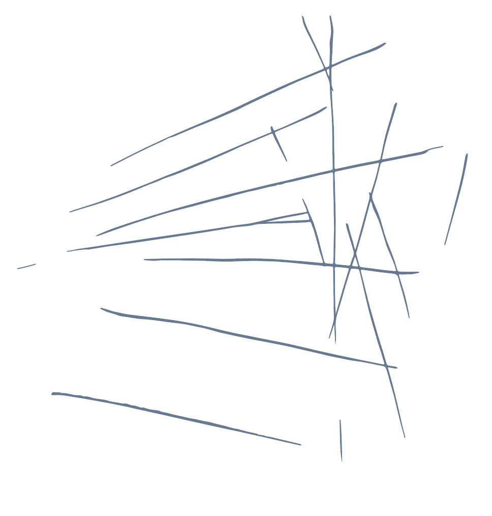
We discussed that my lines which I had just originally traced over in Illustrator were too blocky and had lost the sketchy feel I was going for. So I decided just to image trace my originally sketched lines meaning it would show a difference in the weight of a line.
Original:


Developed:


Fonts
I decided to keep the same fonts however make it lighter in weight. Because it will making the design seem more light and dynamic.
Original:

Final:

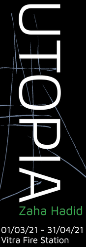
Development Poster
I decided to go ahead and develop my poster. I was not happy with my final design so I had to go on and create new designs. I created many versions:

I really tried to focus on making a dynamic design I created many slightly different variations but I knew by the end I wanted to have a black background, because that feature in many of Zaha's sketches and green line to separate it from the text and give the idea of utopia which is coming from the buildings.
Decided poster
I then went onto create a poster from the many variations I took. In this poster I used an image of where the Exhibition will be set so it made more sense to the viewer. I also changed the font here to make it more light. I was a bit stuck with this design so I looked at another example from the Festival identities book.
La Batie 2016 - Neo Neo

I looked at these set of posters above. I took the grid idea of having a picture in the middle and text surrounding it with and graphic image overlaid on top. Because it helps to show the fluidity of the designs.


I used a variety of different colours to see which were best. I also repeated my line to emphasis it however on further inspection I realised I had to make my lines more related to the imagery behind it. So I went ahead and sketched more lines to make them more in keeping with the buildings.
Lines Final
Vitra Fire Station:

MAXXI:

Cincinnati:
Final Poster Designs:


Extra Printed Ephemera
Having created my poster I set out to create extra printed ephemera that could help back up the cohesive identity. Because I had created my final design of the poster it was easy for my to go ahead and create smaller printed ephemera that was cohesive with the design.
Post card
I decided to create a post card for my collection of printed stuff because for me I always collect post cards from the exhibitions I have been to. So creating one is something that I would want. I kept it very simple only using the lines as the main imagery.
Initial design:

Final Design:

Invitation/flyer
I created an invitation/flyer for each place the exhibition will be set just so it can get the word across to the general public that this event is happening. I made it half the size of a book mark so it could be easily used as a book mark and it could also be inserted into books that could be sold alongside the exhibition.
Initial Design:


Comments