Project 3 - Poster Designs
- Nov 22, 2020
- 3 min read
After I had established my logo, font, imagery and colour. I decided to move on and create a poster. I decided to do the poster first because that meant I could establish a grid that a I could bring across to multiple designs. I wanted to create a grid that was fairly abstract similar to Zaha Hadid style. So I decided to do some research on abstract grids.
Research
Through out my process for designing the poster I would go back and read chapter from the book Ambrose, G. and Harris, P., (2015). The Layout Book. 2nd ed. London: Bloomsbury. This book helped me to understand more this use of whitespace and graphic elements to help create a useful layout.
Design is a plan for arranging elements in such a way as best to accomplish a particular purpose
- Charles Eames
Chueng, V (ed)., (2020). Graphic Fest: Spot On Identities For Festivals And Fairs. 2nd ed. Hong Kong: Viction:workshop ldt.
I looked at this book so I could see some visual identities which may not specifically be for exhibitions but they are for events. This book was useful in showing many different examples of more experimental and abstract graphic design.
Tommy Li P.O.P. Design Show - Milkxhake

This was an example from the Graphic Fest book. I really liked the layout of the poster and how the text is circling the imagery. There is also I slight over lap linking the text and the imagery together. It also caught my eye through the use of a monochromatic colour palette. Making it seem very minimalist and simple.
Festival De Arte Urbano - Julia Foti

I also looked at this designer in the book where the designer used a simple graphic element to make the many different graphic ephemera cohesive this is something what I want to do with my lines, incorporate it in everything to make it more cohesive.
Previous Exhibition Poster

I also looked at previous exhibitions designs. The one above is minimalist and only has one main graphic element. This is something I will consider in my own designs.
Poster Initial Designs


After looking at the research I sketched out my initial idea roughly in my note book. I find this is the bet way to sift through all my possible ideas and evaluate and hopefully continue and move onto the computer with one idea. The idea I chose was the bottom right where the main element is the line.
Poster Development

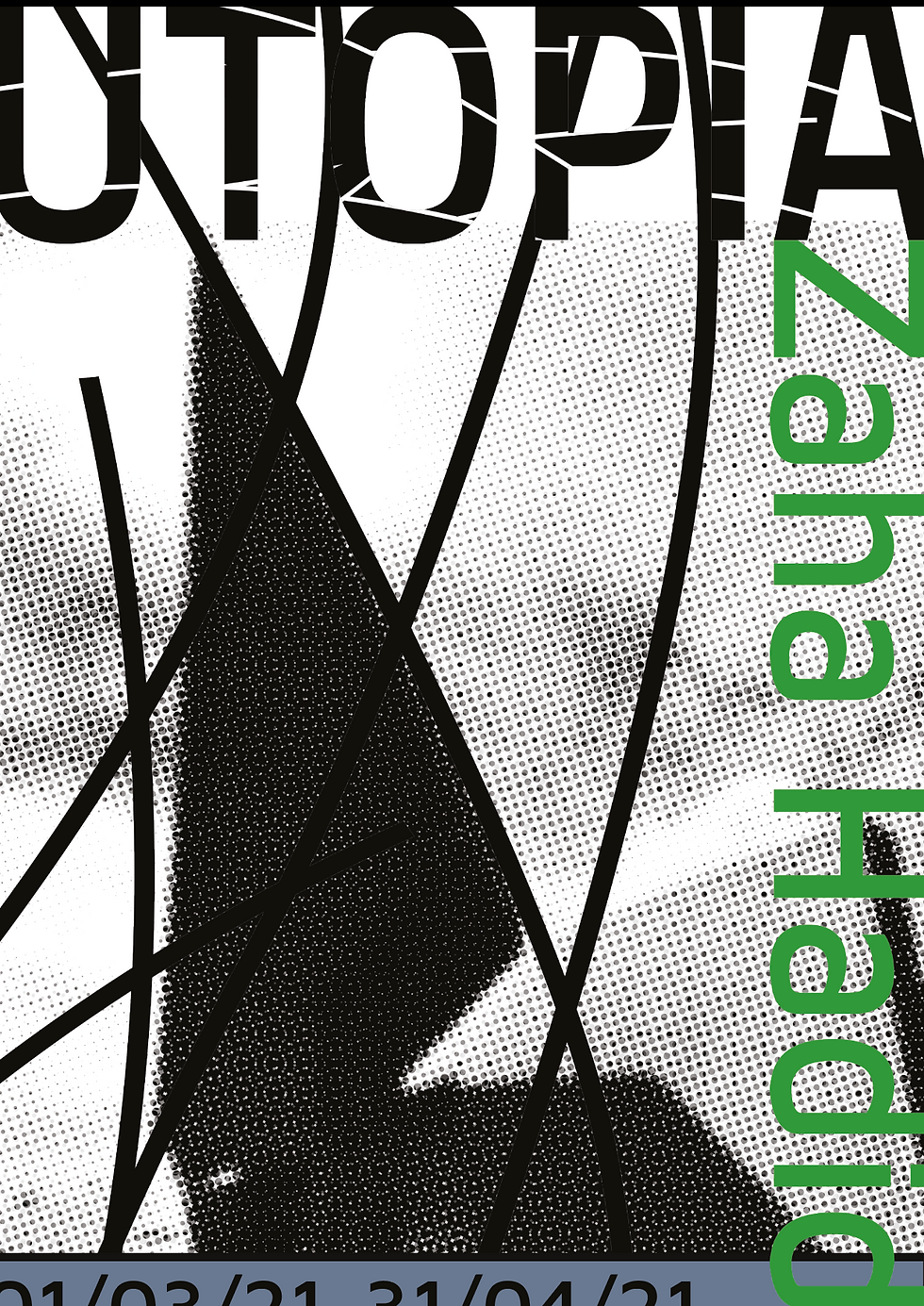
These were the first initial designs I used to create my posters however I thought they were too busy so in the next poster designs I decided to develop them further and simplify.


The poster above is where I start to get more happy with my design the small use of green really draws the eye to the centre and makes the viewer question what they are viewing my idea behind all the focus on the lines is that when you first see them you do not what they are but when you finish you should understand what they are. I also decided to out line the 'subtitle' info to create a clearer hierarchy and link to the line that is used in the centre of the poster. I decided to keep in developing this idea using these colours and this grid format.


The posters above are the first time I try to make one coherent scheme across the different exhibition venues. I decided to try and bring in more whitespace because at the moment everything is very jammed together and it will most likely overwhelm the viewer.


This is was my first possible final design I am pleased with how simple it is and how the lines are the main focus. Just reducing the box helped a lot when creating my design it is much easier to take in than the previous designs. I decided to make all the text fall slightly off the edge because it made the seem more grounded and joined with the paper making more similar to Zaha's idea of making her building seem like they are joined to the earth. However I decided to not go with this design because I felt like there was something missing on the page.
Possible Final Design 2


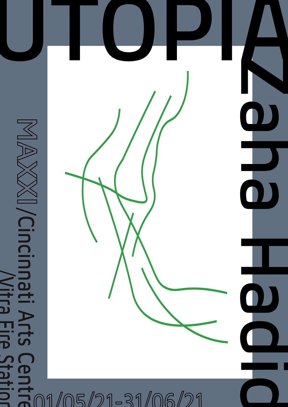

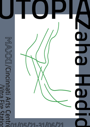


This other Design is exactly the same layout as the other poster but to frame the lines there was the use of colour. I chose this design because the blue links all the elements together whilst leaving time for the eye to first view the green lines.


Comments