Data Visualisation
- Oct 19, 2019
- 2 min read
Updated: Nov 11, 2019
What is it?
Data Visualisation simply means representing data visually. It becomes ever more prevalent the more computers are in our lives because they convert everything into 1s and 0s or Data.
“The purpose of visualisation is insight, not pictures”
Ben Shneiderman
The purpose of data represented visualising is to help aide the viewer into understanding the data in front of them.
How is it represented?
There are a few different ways of representing data:
Process
Is where data follows a step by stop process or a certain movement/path. Christoph Niemann's Sketch of hearing a mosquito he represented the data in a flow chart.

This is a simple way of showing the options and process that you go through to kill a mosquito in your room.
Blocks
Where data is shown in the form of a geometric shape. The simplicity of the shapes helps the viewer to easily understand the represented data. Gretchen Nash used blocks to represent the data frequency of words that occurred in all the letter she kept as a child.

Circles
A circle represents a whole form so it is easy to see the quantity of data when that whole form is split into parts. Joshua Krisen used a circle to help show the amount of people who had donated to an art gallery (Arts Council of Princeton, ACP).

He used lighting to help shine the names of any selected donor helping to represent the data e.g. the names of the donors. It creates an interesting twist on the common pie chart.
Curves
This shows data in sequences of paths. The design agency NOCC represented curves in a different way by tracking sound waves (data) of different words they were able to create objects from those waves.

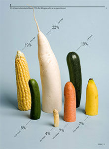
Dataology
Its the bridge between abstract objects and data. Trying to turn them into symbols that people will understand and recognise. Sarah Illenberger used fruit to represent the myths of sex.
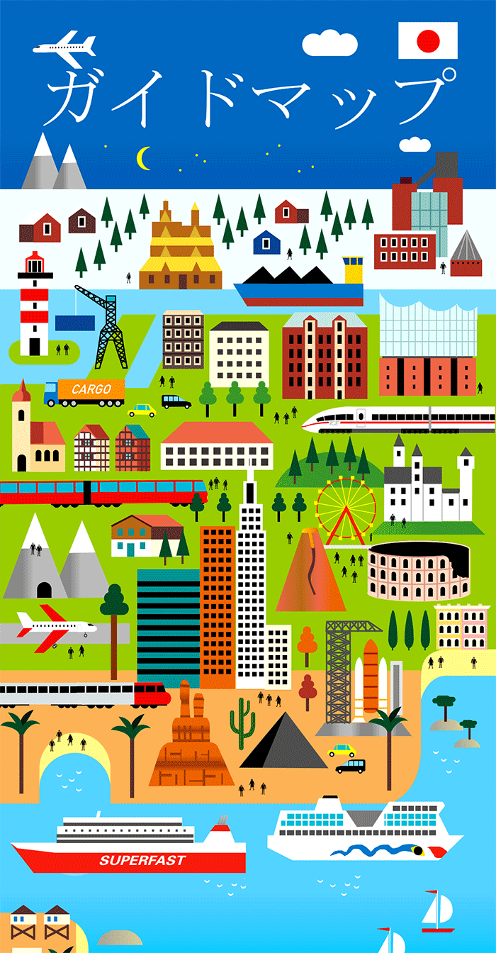
Maps
Data maps is another way to help us view data. It is probably one of the oldest ways to view data visually. Human Empire created a simple map for the largest model railway in the world Miniatur Wunderland.
Putting it in Practice
In my own lecture about data visulisation we created our own data. First, a map showing where we think certain places are in the UK.

We then used the technique of data blocking to visualise our weekly routine.

It was interesting seeing how easily we could visually represent data making it much easier to understand.


Comments