Website Design/App Development
- Mar 5, 2021
- 3 min read
To continue on from my stationary design. I decided to start creating a website design. I had two tutorials cover different software to create a website. The frist software was Wix, which I already use so I was already familiar with it. The second tutorial was a new web design software which I had not heard of which is called cargo. Which is more geared towards designers however does have a little less freedom than WIX.
Wix Design
I found from designing in Wix that my logo design did not seem to work the way I wanted it to. I felt as I was designing the logo was not actually representing me.
Logo Development
So I decided to try it with the three lines that I had been using additionally with my 'PL'.

Which I put into the Wix website. However when I went onto creating my design in another software (cargo). I once again evaluated and felt that my design was not that representative of me.
So I went away and did some research of other existing logos which use lines in their logos I tried to also consider the reason why they have used lines in their logos:
Lucy Lee Quality Recordings Label
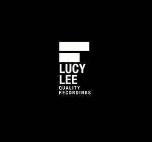
In this logo the words Lucy and Lee are blanked out, demonstrating the intention of the company (being diverse enough) to evade any easy labelling.
Munich Reinsurance

A group logo, parallel bars that form a square, to symbolise connection, exchange, partnership, interaction, work and enterprise.
Mori Art Center

This is the logo I like the best as it represents a collection of waveforms, suggesting a spectrum of cultural activity.
From this research I decided to go back to the drawing board and develop my logo through creating more sketching:

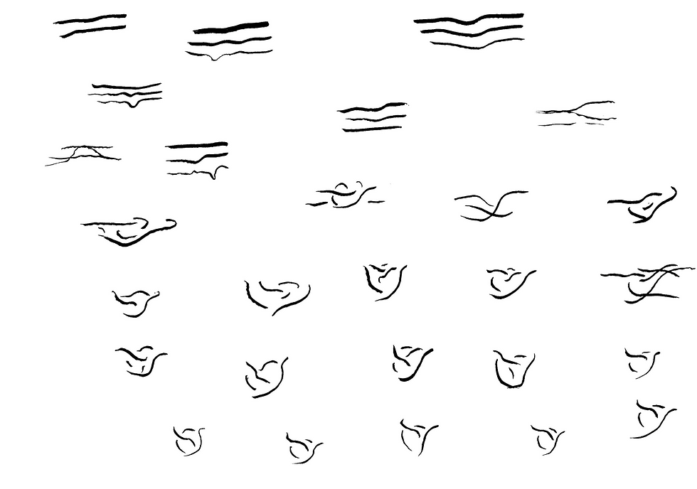

I developed my lines into something that I felt represent me. Because my middle name is Rose and due to that I have always had a fascination with nature and flowers; especially their natural colours and design. I use nature as a source for inspiration in my designs. After deciding this I did the same as I have previously done. I used Illustrator to develop my design further.

I went ahead and took my favourite from this design and put it into context to see what it would look like:

I kept with the blue colour that I had used in my previous logo however I made more bright. As this is my favourite colour thus representing myself. I then experimented with putting another splash of colour behind it:
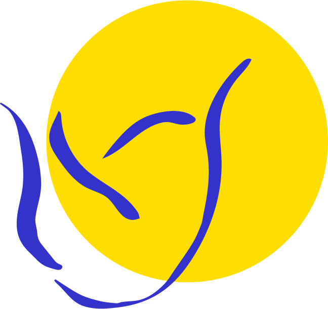

I decided to put a colour behind it as I thought it was quite empty otherwise.
Further Development
I then decided to do further development as I spoke to quite a few people and most of them didn't see a rose. Though I want my rose to be fairly abstract I still want people to be able to recognise that it is a rose. To get a better understand of how to make a more legible rose I looked at other examples of roses in logos.


From looking at these examples I realised my line though it looked like it was sketched made it seem a bit unprofessional so I knew I needed to edit my line to get the most professional look out of the design.

Above is the development stage of my designs. The last is my most recent and developed design. When designing I had a brain wave and realised I need more lines in order to make it look more like a rose.
Most Recent Logo:

I am still debating whether I want to put a colour behind it but at the moment this is my main design.


Comments