Visual Systems - Project 2
- Nov 4, 2020
- 3 min read
Brief
In this project I was tasked with creating a visual systems from two stimuli Market and Complexity.
Initial Research
I first made sure that I was completely clear on what my two words meant. I looked up the definition to understand them more. I then decided to further my research and go to the covered market. Which is a famous market in Oxford.

I took many photos of the market and it made me realise that this market just needs to be stripped back and started again with a cohesive design. As there were multiple different colours, type and imagery all in one small place. I found it very confusing to navigate myself around the market even though I have been there may times before.
After the visit I decided to look deeper into the complexity of the market through looking at the history and heritage. I found a survey on the Oxford City Council website describing the history and many different aspects of the market.
Concept

Secondary Research
I started to look at secondary research to get ideas on how I would want to create this way finding system.
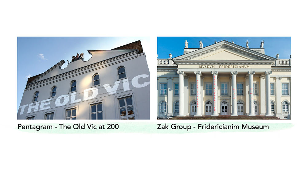
I looked at two big design agencies who brought historical places into the modern age mainly through using typography. Both examples used the buildings to their advantage. As they used the historical surroundings and through colour and sans serif text they brought the building into the modern age. I definitely want to bring this into my own design.

Moving on from the Pentagram and Zak Group Project. I looked at some installation artists, Morag Myerscough and Liz West, Myerscough used colour and pain to bring her home into life, I like that she brought the colour onto the floor as well as the walls this is something that I will use in my own design because it is a way to lead the viewer around. Liz west used colours and light to create interesting installation this was the first thing I saw that made me consider to put my way finding design onto the floor.
Initial Sketches

These were the quick sketches on how I could create the design after being inspired by me secondary research. I was pleased with this idea and decided to keep on going so I did more research in looking at the right font and colours.

Initial Mock Up
I moved into illustrator to create my initial mockups. I used the free transform tool to create perspective on the writing and splashes of colour on the floor and walls. I also used a photo I had taken to have a back drop on the design.

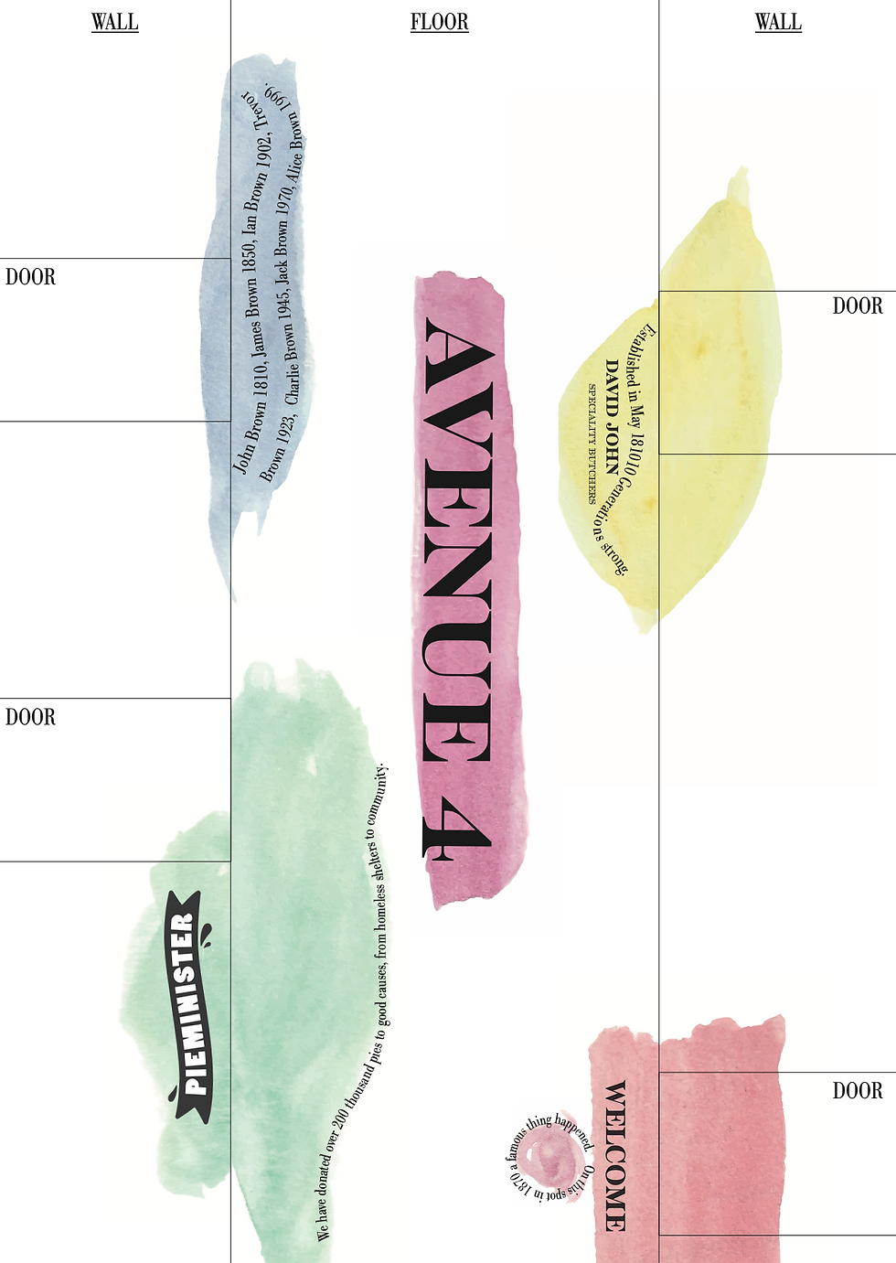
I made a map and a non/perspective view of an avenue. In the avenue it is is depicting that everything in the market other than the pain splashes and logo of the market would be white. I was pleased with how it come out but after further evaluation I knew I could do more with it. Such as making the font easier to read and creating a more obvious way finding system.
Further Research


Primary Research
After looking at more examples of way finding I decided to go back and sketch some new ideas and create some new icons for the space.

I traced over some images so I could create some new ideas on an accurate sketch. I then used this simple line drawing in my main design.
Final Design
Entrance Way Example and Key

Avenue Example and Map

Each of these mock ups would have a slightly different colour scheme for each avenue/entrance way but the fundamentals would be the same.


Comments